Showing posts with label Europe. Show all posts

Monday, May 17, 2010

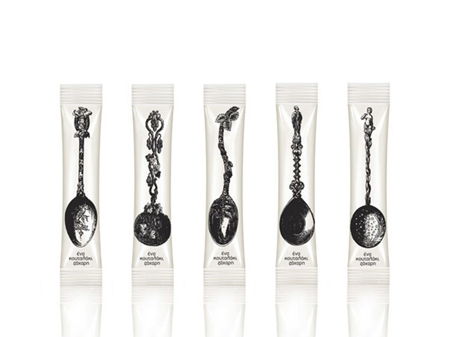
A Teaspoon of Sugar

mouse graphic sugar packaging
Latest work by Mouse Graphics, Greece.
This work is a conscious attempt to literally interpret the pack content: 'One spoonful of sugar' - visually and verbally stated. Straightforward and simple, the pack design obviously invites to a more decorative daily cupper.

Sunday, May 16, 2010

Ipacs Winery

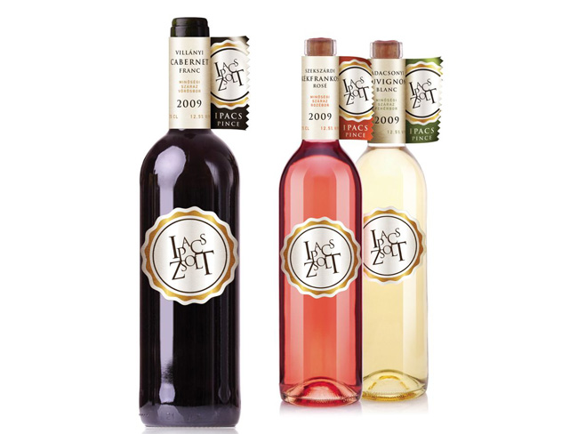
Ipacs Winery is a young, emerging, dynamic developing and already successful winery led by an ambitious owner.
ipacs winery wine bottles

Our task was to design the CI and the packaging for the winery. Neither the package-technology nor the budget of Ipacs can rival with the historic wineries. Thus the designer's goal was to make advantage of the disadvantage. The quite unusual flag-like label was born thanks to this pressure. The label holds all important information so the tag on the bottle could concentrate exclusively on the branding.

Designed by Café Design, Hungary.

Wednesday, May 12, 2010

The Bay Tree

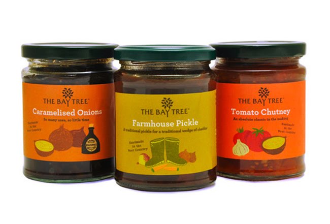
Bay Tree Range

Bay Tree Bottles
Irving have been commissioned by the founders of The Bay Tree to overhaul their complete range of food products. In short their philosophy is that The Bay Tree food products offer a ‘helping hand in the kitchen’. Products such as ready made cooking sauces, pickles and condiments help busy people save time in the kitchen. All of the products are hand made in The Bay Tree kitchens rather than processed in a large factory. The best possible ingredients are used and were possible they are sourced locally – these ingredients are often reflected on the labels. The hands-on, informal and friendly approach of the founders Emma McDonald and Lucie Lewis is reflected in the design of the labels. Irving have been working with the celebrated British illustrator Chris Brown to bring charm, wit and a distinctive personality to the brand.

Designed by Irving & Co, United Kingdom.

Monday, May 10, 2010

Vinhos Lagosta


Pitch proposal for the re branding & new packaging of Rosé & Vinho verde of Lagosta Wines. Lagosta (Lobster) is a fresh summery wine that goes well with all kinds of fish and sea food.


The proposal of the bottle aimed to recreate and modernize the traditional "Mateus Rosé" bottle while aiming for a more sophisticated audience.

Concept by Rui Granjo, Portugal.

Superdrug Tea Tree

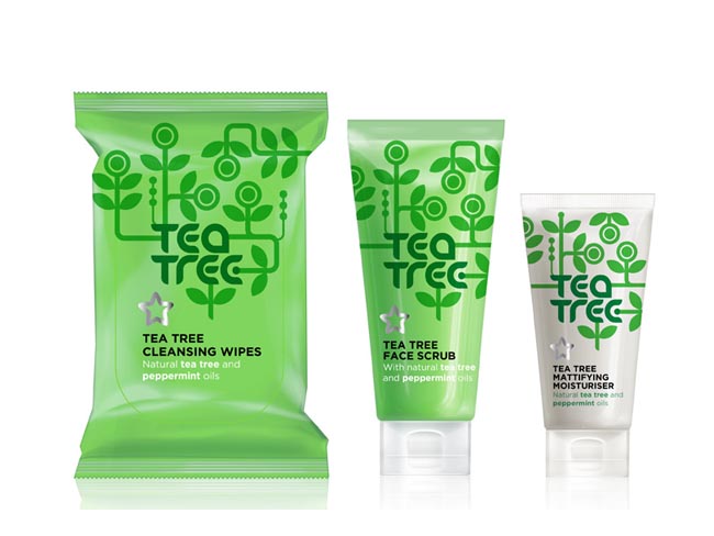
superdrug tea tree range
Superdrug Tea Tree range designed by Burst Ltd, United Kingdom.

Schmoo

biz-R have recently completed a naming, brand identity and packaging project for ‘Schmoo’, a new yoghurt lassi drink.
Schmoo, a Leeds based company, plan to bring the authentic Indian lassi to the UK mainstream. The brand positions itself uniquely between smoothie and dairy (which has also formed the basis for the new name) and uses 100% pure ingredients with no preservatives - created using genuine Indian recipes.


“The identity draws influence from traditional Indian henna (mehndi) illustration but is executed in a contemporary aesthetic with a touch of modern opulence. East meets West if you will. The brand offers a clear point of differentiation from other drinks commonly sharing shelf space. An exciting, healthy product with a sense of confident sophistication - this formed the basis for our brand direction for Schmoo. The final result is both unique and eye-catching. It communicates beautifully and stands apart from anything else on the market.”

- Blair Thomson Creative Director / biz-R


The striking label design has been printed onto a silver foil stock and combined with fresh bright colours to differentiate the flavours in the range. The brand seeks to ‘shake up’ the bottled drinks sector by introducing the lassi to the mass market - which would usually be limited to specialist Asian stores and Indian restaurants.


Hayley Hadfield, Managing Director of Schmoo comments:
“From the initial brand workshops biz-R ‘got it’. They understood the essence of the brand and were not shy in coming forward with ideas. This was the confidence we were looking for and that was difficult to find with other agencies. We are really excited at the prospect of developing Schmoo together and continuing to take it forward.” Schmoo has been launched initially in Tesco stores throughout North England with plans for further expansion in the near future.

Designed by biz-R, United Kingdom.

Boost Your Wash

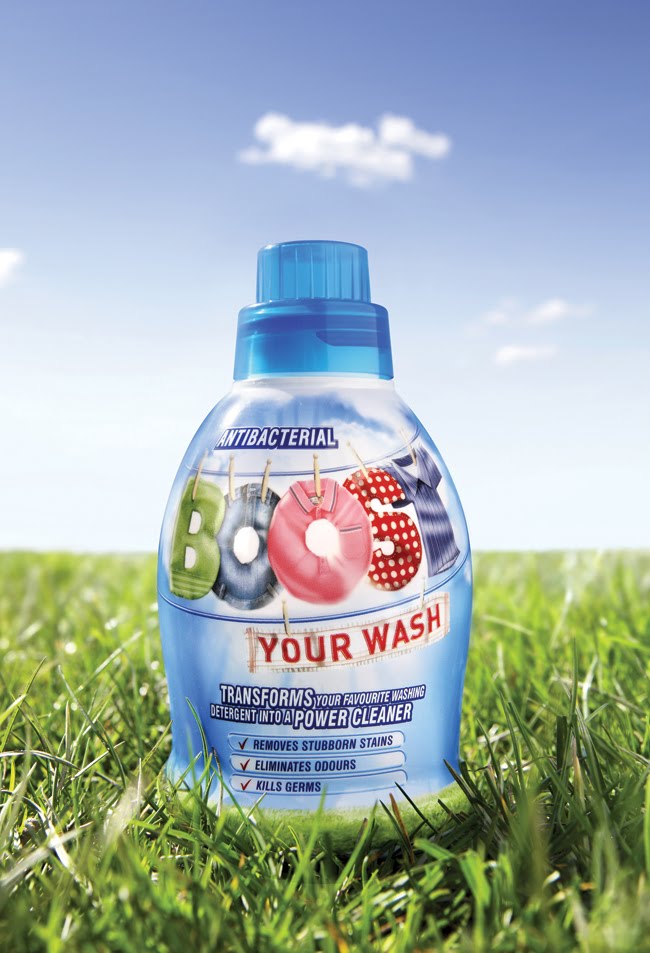
The Core has created the new pack design and structure for an innovative new product set to revolutionise the UK laundry industry. Developed by Challs International, Boost Your Wash is a brand new wash enhancer with a unique formula designed to transform any washing detergent into a powerful cleaner. And unlike washing powder, it has antibacterial properties, so it not only tackles stubborn stains but also kills bacteria, leaving laundry clean, fresh and odour and germ free.
 Boost Your Wash closeup

Like its unique formula, Boost’s packaging offers a shake-up for the category. ”It’s a different kind of a design for a different kind of a product”, says Andy Briscoe, Creative Partner, The Core. “We wanted it to feel more like a little helper than a stain remover, so we deliberately distanced ourselves from the ‘scientific’ swooshes, molecules and atomic-era colours which dominate that category. The laundry cues are all there – the clothes, the open-air freshness, the burst of sunlight, but they come together in a new, contemporary illustrative style that sets Boost apart from its competitors.”

 Boost Your Wash
In a fixture dominated by tall bottles and big boxes, Boost’s structure is also set to make an impact on shelf. Bespoke designed by The Core, the bottle has a broad base and a stocky, curvaceous build that has something of the ‘little hero’ about it, with echoes of other small-but-powerful products like probiotics and energy shots.

Says Kieran MacSweeney, Sales Director of Challs International: “We’re really excited about the launch of Boost Your Wash as it brings something brand new to the UK laundry industry. Our research shows consumers are waiting for a product like Boost Your Wash so we’re confident it’s going to be a real success. The timing is good too as the tough economic conditions mean consumers are being financially conscious but still want the best results possible for their daily washing. Boost Your Wash will enable them to beat all of their laundry challenges including stubborn stains, odours and germs.”

Boost Your Wash will be available to retailers from the beginning of May, RRP £3.99, and launches to consumers later this year supported by a national TV campaign.

Designed by The Core, United Kingdom.

Thursday, May 6, 2010

WAT-AHH!

See what Kelly, a 22-year-old college student, has to say about this funny new beverage called WAT-AHH!
WAT-AAH! is a great product because it’s basically it is targeted to kids to make them choose water instead of sugary, fattening drinks. The entire mission of WAT-AAH! is to prevent obesity in children. Living in the US, I think that’s a great idea because it is one of the fattest countries in the world (not the fattest, but #9 on the fattest countries list according to a study done by the World Health Organization, yup I researched this, Nauru is #1).


I thought the whole style of the bottle was really fun and eye-catching for kids. It’s not just a boring Aquafina bottle or Poland Spring, it’s got a different shape and the colors used to write WAT-AAH! is eye catching, I feel like kids would think this whole style is very hip and cool looking.

Wednesday, May 5, 2010

Delphic Acolyte


Delphic's Limited edition "Acolyte" CD packaging with slipcase, exclusive to HMV stores.
Designed by Non Format, United States and Norway.

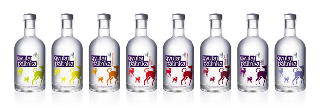
Gyulai Palinka Spirit

The original 'pálinka' is a distilled spirit made of fermented fruits.
Only those products can be referred to the 'pálinka' which are made from
Hungarian fruits, have 100% fruit content and got 37,5% of alcohol strength
as a minimum.
gyulai_palinka bottle

The first distillery in Gyula was founded by János György Harruckern in
1731. This nearly 300 year-tradition is carrying on by Gyulai Pálinka
Manufacture (in these days).

gyulai_palinka bottle range
The task was to create a new packaging design which focuses to the mature
young generation. The key motive of the new design is the Hungarian hound,
which is fidelity, nobility and got all the traditional values.

Designed by Peter Berki of Café Design, Hungary.

Thursday, April 29, 2010

Balblair


Nice little scotch whiskey packaging designed by NTGJ, Portugal.

Wednesday, April 28, 2010

Breuckelen Gin


Breuckelen Distilling Company asked us to work with them on the branding of their new bottles and packaging.

Breuckelen Distilling is an artisan distillery located in Brooklyn, New York. They handcraft delicious gin from organic New York grains entirely within their Brooklyn location. Breuckelen is a tiny fraction of the size of typical distilleries but their production methods create products of the highest quality.

Breuckelen’s founder, Brad Estabrooke, is an ordinary guy with an extraordinary love of distinctive wines and spirits. He began studying the art of distilling almost two years ago now, and his passion for it has grown exponentially since his studies began.

Designed by I love Dust, UK.

Tuesday, April 27, 2010

Jan Robben

Jan Robben is a strawberry grower with a passion for his product, and a dedication to producing fruit of a higher standard than your ‘average’ strawberry. In 1998, his company was the first in the Netherlands to receive the Milieukeur certificate.* We designed a packaging that presented his strawberries in a way similar to a box of chocolates – as an exclusive, luxurious treat rather than a commodity. The packaging has a natural, intimate look-and-feel, featuring birds, Robbens’ butterfly logo and his signature, reflecting his personal devotion and care for the environment. This enabled Jan Robben to change his market strategy and achieve significant business improvement.


The objectives were to differentiate the product from the commodity competition, and successfully position it as a higher-margin product. Special emphasis also had to be placed on Jan Robbens’ personal care and passion, and the environmentally friendly processes with which the berries are produced.

*The Milieukeur certificate is awarded for special efforts in the field of natural, environmentally friendly production processes. Milieukeur products are very similar to organic products, but a limited amount of chemical crop-protection agents and artificial fertilisers are permitted in their production.

Designed by Reggs, The Netherlands.

National Coffees


Simon Lévelt wanted its premium range of National Coffees to attract a new target group: ‘Cultural Creatives’, who value peace, spirituality, creativity and social justice. They appreciate products that are made with care, and preferably organic. These consumers are critical about what they buy, and want to know the story behind the products. Reggs responded by designing a package that ‘tells’ this story at a glance, visualising the coffee’s heritage and the authentic character of its country of origin.


The objectives were to appeal to cultural creatives – in the busy retail environment – to buy a coffee that is ‘honest’ and carefully selected in its country of origin. This is now communicated immediately by the packaging, and presented in a way that appeals to the lifestyle and design preferences of cultural creatives.

Simon Lévelt has been passionate about coffee and tea for over 200 years: a passion that is translated into small-scale and traditional production processes, direct and fair trade, and a preference for organic ingredients. The company’s market model is built around sales via franchise shops, as well as indirectly via out-of-home and retail channels.

Designed by Reggs, The Netherlands.

Oepure


Oepure is an "egg" with photo-catalytic properties made of Japanese ceramics. Anywhere in the home, from the bathroom to your refrigerator, it absorbs and destroys smells, bacteria, moisture and even VOC. Its action lasts for years, and simply regenerates with sunlight.
This innovative yet very simple product deserved a case displaying its qualities : delicate, environment-friendly, easy to understand and to use. I designed the logo and packaging with these keywords in mind. The result is a simple cardboard case with an egg-shaped window, slowly unveiling the egg by opening like a flower around it.
To be more Eco-friendly the recycled cardboard box is printed with a vegetal ink, and folds without any glue.

Designed by Estelle Berger, France.

Pure and Nature

The Pure and Nature product group is a Kruidvat* private-label range designed for daily face and body skincare. Pure and Nature products consist of all-natural ingredients, and are the first private-label products in the Netherlands to carry the BIDH quality mark.**
Reggs created a design that is eye-catching on the shelves, but which also radiates a simple, uncomplicated look-and-feel that reflects and emphasises the products’ all-natural, high-quality characteristics. The Pure and Nature packaging makes an appealing, fresh and pure statement, in which the Kruidvat values also remain visible.
*Kruidvat Retail is part of A.S. Watson (Health & Beauty Continental Europe) BV and, with 941 stores, is market leader in the Benelux health and beauty sector.
** The BIDH mark guarantees that products do not contain any synthetic colouring, scent or preservatives, as well as any synthetic silicones, paraffin or other oil-based products. Furthermore, the natural ingredients have been, whenever possible, organically cultivated and have not been tested on animals.


As consumers become increasingly aware of the impact that products can have on their personal wellbeing, there is a growing demand for products that are honest and natural – such as natural cosmetics in the health and beauty sector. The ingredients in such cosmetics are environmentally friendly, which assures consumers that these are not only a healthy products you can trust, but ones that are also less harmful to the earth. The objective was to tell this story to consumers through every aspect of the visual design.


Designed by Reggs, The Netherlands.

Wednesday, April 21, 2010

Mothercare All We Know


John Rushworth and Daniel Weil have designed the branding and packaging for All We Know, a new range of baby toiletries for Mothercare. The creation of a coherent and focused sub-brand enables Mothercare to draw on its reputation as a trusted brand whilst adding new elements that help to differentiate these products from the competition. The All We Know range contains natural extracts, is suitable from birth and has been tested by a panel of midwives.

The sub-brand is built around the name All We Know and is supported through the label copy, which gives clear information to the customer in a knowledgeable and calm tone of voice. All We Know label designs include the Mothercare symbol and name as the primary brand identifiers.

The range packaging has been specifically designed with a number of outstanding features. The bottle is very distinctive, as it represents part of the ‘m’ in the Mothercare symbol. The curved face fits in the hand, the flat end allows it to rest horizontally, practical for use in the bath, and the bottle is designed to be opened with one hand. When almost empty it can be turned on its head in order to get out the last drops. From the perspective of the retailer the bottle stacks easily and stands out on in-store shelf displays.


The range launched early this year and is now available worldwide.


Designed by Pentagram, United Kingdom.

Momiji


Momiji packaging range consisting of message dolls, mugs and hand-held mirror, all designed by Pounce, United Kingdom.

Tuesday, April 13, 2010

Avonmore


Avonmore is the current number 3 selling grocery brand in the country so we were only too aware of the potential impact that a packaging overhaul can create. The project ambition was to unify Avonmore's broad portfolio. while allowing each product brand to have its own character and individuality.

Designed by Dynamo, Ireland.

Voya


We were estatic to receive a Silver ICAD bell at the awards in November. For the last 2 years we have been working really closely with the VOYA team in developing their new and extensive range of 100% organic beauty products. In addition to the work winning a design award, the range is now in huge demand and is being stocked in some of the finest health spas and exclusive retailers including House of Fraser, Avoca Handweavers and Nue Blue Eriu.

Designed by Dynamo, Ireland.