Showing posts with label Beverages. Show all posts

Monday, May 17, 2010

MYGO Super Fruits

MYGO is a new generation of drink, a super fruit juice, rich in antioxidants. It contains GOJI berry, an ancient Chinese medicinal fruit, often called “ the fruit of happiness”. It is believed to stimulate and boost your fundamental energy. Mygo is also rich in Vitamin C, and is a healthy and effective alternative to current energy drinks.
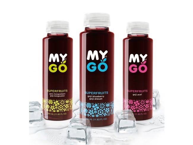
MYGO Super Fruits Group Shot

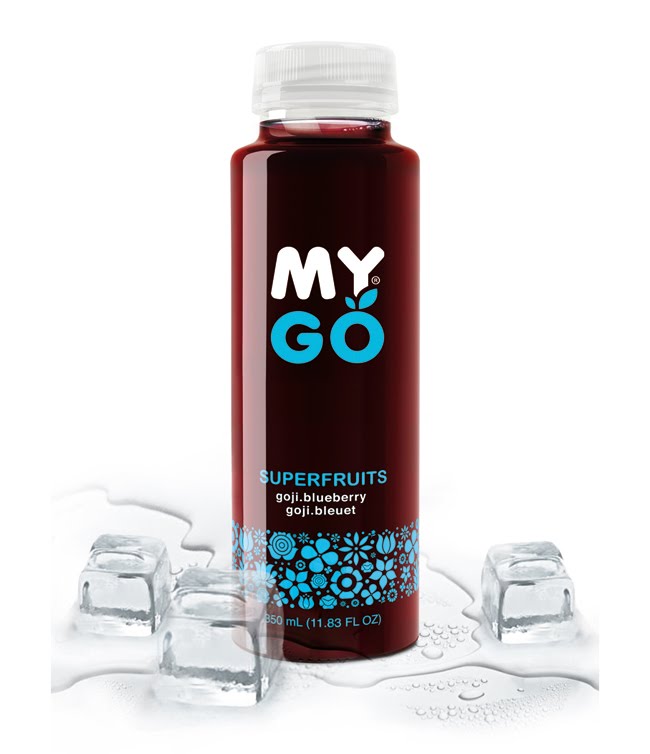
MYGO Super Fruits Blue
Delicious fruit cocktail made of a combination of Blueberry and Gojiberry, a fruit with one of the highest concentrations of vitamin C, full of nutrients and antioxidants. MYGO BLUE combines these two fruits for an intense experience. Super tasty, super vitaminized, super healthy. Known to contain high levels of anthocyanins.

Designed by B&T.

Wednesday, May 12, 2010

Monday, May 10, 2010

Schmoo

biz-R have recently completed a naming, brand identity and packaging project for ‘Schmoo’, a new yoghurt lassi drink.
Schmoo, a Leeds based company, plan to bring the authentic Indian lassi to the UK mainstream. The brand positions itself uniquely between smoothie and dairy (which has also formed the basis for the new name) and uses 100% pure ingredients with no preservatives - created using genuine Indian recipes.


“The identity draws influence from traditional Indian henna (mehndi) illustration but is executed in a contemporary aesthetic with a touch of modern opulence. East meets West if you will. The brand offers a clear point of differentiation from other drinks commonly sharing shelf space. An exciting, healthy product with a sense of confident sophistication - this formed the basis for our brand direction for Schmoo. The final result is both unique and eye-catching. It communicates beautifully and stands apart from anything else on the market.”

- Blair Thomson Creative Director / biz-R


The striking label design has been printed onto a silver foil stock and combined with fresh bright colours to differentiate the flavours in the range. The brand seeks to ‘shake up’ the bottled drinks sector by introducing the lassi to the mass market - which would usually be limited to specialist Asian stores and Indian restaurants.


Hayley Hadfield, Managing Director of Schmoo comments:
“From the initial brand workshops biz-R ‘got it’. They understood the essence of the brand and were not shy in coming forward with ideas. This was the confidence we were looking for and that was difficult to find with other agencies. We are really excited at the prospect of developing Schmoo together and continuing to take it forward.” Schmoo has been launched initially in Tesco stores throughout North England with plans for further expansion in the near future.

Designed by biz-R, United Kingdom.

Thursday, May 6, 2010

WAT-AHH!

See what Kelly, a 22-year-old college student, has to say about this funny new beverage called WAT-AHH!
WAT-AAH! is a great product because it’s basically it is targeted to kids to make them choose water instead of sugary, fattening drinks. The entire mission of WAT-AAH! is to prevent obesity in children. Living in the US, I think that’s a great idea because it is one of the fattest countries in the world (not the fattest, but #9 on the fattest countries list according to a study done by the World Health Organization, yup I researched this, Nauru is #1).


I thought the whole style of the bottle was really fun and eye-catching for kids. It’s not just a boring Aquafina bottle or Poland Spring, it’s got a different shape and the colors used to write WAT-AAH! is eye catching, I feel like kids would think this whole style is very hip and cool looking.

Friday, April 30, 2010

PomeGreen Tea

DDC Creative Lab agency designed bottle shape and visual solution for a new product of BevMarketing Group Inc – the cold green tea containing pomegranate juice PomeGreen Tea.


The task of the agency was to create a package design, emphasizing naturalness, authenticity and individuality of the product, with reference to the traditional Eastern style.


The agency developed a low bottle, covered with shrink wrap and visual solution in fresh and emotional oriental style. Key design elements include painting, stylized traditional Chinese watercolor, juicy colors, folk motifs and Chinese calligraphy.

The work has entered a short-list of Identity: Best of the Best 2010 in the "Packaging Design" category.

Designed by DDC Creative Lab , Russia.

Thursday, April 29, 2010

Ziba


An energy / weight loss drink for the young health-nut that wants to lose weight. The packaging strip doubles as a measuring tape to track your progress and the bottle's label marks how much you should drink during your workout to stay hydrated and healthy.

Designed by Laura Berglund, United States.

Wednesday, April 28, 2010

Tuesday, April 27, 2010

National Coffees


Simon Lévelt wanted its premium range of National Coffees to attract a new target group: ‘Cultural Creatives’, who value peace, spirituality, creativity and social justice. They appreciate products that are made with care, and preferably organic. These consumers are critical about what they buy, and want to know the story behind the products. Reggs responded by designing a package that ‘tells’ this story at a glance, visualising the coffee’s heritage and the authentic character of its country of origin.


The objectives were to appeal to cultural creatives – in the busy retail environment – to buy a coffee that is ‘honest’ and carefully selected in its country of origin. This is now communicated immediately by the packaging, and presented in a way that appeals to the lifestyle and design preferences of cultural creatives.

Simon Lévelt has been passionate about coffee and tea for over 200 years: a passion that is translated into small-scale and traditional production processes, direct and fair trade, and a preference for organic ingredients. The company’s market model is built around sales via franchise shops, as well as indirectly via out-of-home and retail channels.

Designed by Reggs, The Netherlands.

CareMore Invitation


This sparkling wine bottle and packaging was developed as an invitation for our healthcare client, CareMore. They are holding an awards ceremony to honor their top sales people and wanted an elegant and unique way to present invitations to the employees that were selected to attend. The awards ceremony will take place at the Encore in Las Vegas, and I decided to design a champagne invite since this was a celebration. It was also Important to incorporate the look and feel of the Encore into the presentation. The Encore resort is decorated in red butterflies and luxury furnishings, so that is the creative direction we decided to take. The bottles are packaged in a tube to match the invite.

Designed by Maranda Mitchell who is working at Traffik, USA.

Taaza Thanda Tea


The challenge was to combine the refreshing properties of a predominantly hot beverage (tea); hence the name Taaza Thanda (that means 'Fresh & Cool' in Hindi). The typography, colour palate, dynamic use of tea leaves and the model were creatively used to depict a cool 'hot' beverage.

Designed by DMA Yellow Works, India.

Thursday, April 15, 2010

Taj Mahal Tea


DMA Yellow Works was contacted by Hindustan Unilever Ltd. to redesign the packaging for Taj Mahal Tea. The brief was to create an aura of superior tea. DMA Yellow Works achieved this via design as well as selection of metallic substrates. The result was 18% improvement in volume and off take (excellent response from consumer).

Designed by DMA Yellow Works, India.

Sunday, April 4, 2010

Found Organic


Found Enterprises just launched Found Organic in Australia.
The Design of the label has been created with two thoughts in mind; Transparency and interactivity.
Found has nothing to hide, there is no “back or front” so from any angle the logo and all info can be seen.
The bottle shape expresses simplicity and elegance. The tall conical shape almost resembles a perfume bottle, supporting an ongoing proposition that natural beauty comes from within.
Found is the first carbon neutral juice company in the world, we are 100% organic, pure fruit, no additives, preservatives, etc etc.

Wednesday, March 31, 2010

Kukai Tea


The aim of the brief was to come up with a brand identity and packaging for an organic tea packaging.
I've developed the brand identity Kukai Tea, designing the packaging for 3 flavours, (green tea, lemon tea and orange tea) using my illustrations and a simple squared box for the packaging.

Designed by Natalia Vitorino, Portugal.

Monday, March 22, 2010

Extra Juicy


As Australia’s largest privately owned beverage business, P&N Beverages chose War Design to help develop new products, strategies, re-invigorate visual identity, packaging and print advertising. Due to P&N's production expertise, they are able to bring new products to the market in a very short time in response to any changes or opportunities that may arise. This also requires War Design to interpret these situations and produce suitable designs very quickly. In the past four years, War Design has worked in unison with P&N to deliver a range of successful product launches and relaunches. This close working relationship has ensured P&N now compete with their competition on a more level playing field.

Designed by War Design, Australia.

Sunday, March 21, 2010

Bicervecina El Inca

When Cervecería Boliviana Nacional entrust Adrián Pierini with this project, they were not just asking for a design, but they were instead giving him the great responsibility of recreating the image of a product intimately attached to popular feeling.


“Bicervecina” combines a 3 percent of alcoholic content with a great presence of malt. Its functional goodness is so well known that consumers have enjoyed its benefits for years. If you talk about “El Inca” to any Bolivian, he would be transported to his childhood and his grandparents`, he will remember shared lunches and happy moments in community.
For these reasons, designing this product was not an easy task at all; a minor conceptual error could affect its highly emotional value. Considering this, Pierini and CBN marketing team establish a required instruction: the original aesthetic spirit must be preserved, and graphic intervention would only be possible if the added elements reinforced the emotional profile. Structure, typographic style, and chromatic codes could be improved, but without making a drastic transformation.
The project demanded over a year of work and the process implied analyzing the bond between each and every elements of the pack, how its characters should be modified (its gesture, position, clothes), which technique would manage the ideal presentation (photography or illustration), considering the tones range as a way of modernizing the layout and adding flavor and warmth, and finally looking for the most adequate way of highlighting the brand name with a visual exercise in which lines, shadows and features were gradually altered to reach the perfect enhancement.
The final result exceeded all expectations at its launching. CBN is extremely satisfied with the new packaging, which transmits modernity without resigning tradition and provides flavor without losing warmth. Above all, it also made an increase in the impact of the drink without having affected a layout constrained by its highly emotional value.

Designed by Pierini Partners, Argentina.

Friday, March 5, 2010

Café direct


Designed by Carter Wong Design, United Kingdom.


Café direct is unique in the Fairtrade sector in that they actually know the growers of their products.
This relationship is more than skin deep too – indeed many grower organisations have a shareholding in Café direct and two growers sit on the board. Café direct also invest half their profits to help growers achieve the highest quality.
So how do you express this symbiotic relationship on their new range of packaging without resorting to the obvious ‘men in straw hats’ approach?
Carter Wong Design’s striking and unusual solution features a variety of authentic growers’ tools to emphasize this partnership. The provenance is further authenticated by quotes from the owner of the tool on the front of pack and supported by a photograph of the individual on the back.
An invitation to the consumer to learn more about the community through the Café direct web site completes this link with the individual grower.
The logistics of realising this concept involved photo-shoots in Africa as well as Central America and fully exploited Café direct’s close connections with the grower communities.
The agency has also created Café direct’s exhibition in Whole Foods, the high street retailer. Entitled ’TasteFair’, this runs over the period of Fairtrade Fortnight.

Wednesday, March 3, 2010

Piazza D'Oro


The Piazza D’Oro brand is found the world over but nowhere is the R&G coffee market quite so dynamic as here in Australia. An unwanted de-positioning of Piazza D’Oro had occurred against a trend of Craft, Locality and Authenticity, resulting in an explosion of gourmet and boutique roasters which connected at a much deeper level than Piazza D’Oro. The previous brand expression and execution felt corporate, lacking the human qualities of passion and expertise that’s driving much of the market. As a result the brand was finding it hard to break into new café accounts.

Identifying and unlocking mega trends, archetypes (The Lover) was critical. Decoding the coffee ritual & experience informed the right way to tap into ‘Craft’. The end result is a more human and sensual ‘love mark’, whose execution exudes the sensory theater, and ritual of coffee. The identity is both masculine and feminine at the same time…the ultimate Casonova?

Consumers, brand managers and sales team at a global level are of course …in love.

Designed by Barker Gray, Australia.

Thursday, February 25, 2010

Our Farm Milk


The small factory makes dairy production of the highest quality - without additives and preservatives, from non-polluting milk, very small parties and under the order.

Designed by Nadie Parshina, Russia.

Tuesday, February 23, 2010

Schroeder

The milk fridge at your local grocery store has probably looked the same for eons. America's milk supply is seeing rapid consolidation, driving down prices. Industry leaders have increasingly turned to the development of consumer brands as a way to increase both sales and margins. The resulting proliferation of brands has placed pressure on smaller, regional dairies to differentiate their offerings in the marketplace. It was times for Schroeder to do something drastic.


We designed a completely new look for Schroeder, one that communicated on three levels. The first level is a clean, white opaque package that communicated a European sophistication. The next level is the use of the words One, Two, Whole, and Skim each scaled reflect the fat level of the milk, The last is the use of rotating, esoteric phrases that spoke to consumers in an anti-marketing language. Phrases like for dreamers and optimists and for those who fall somewhere in between. The early results speak for themselves. Schroeder saw a sustained 15% increase in distribution due to their new packaging and 22% increase in sales of milk during a recessionary economy.


Designed by Capsule, United States.