Showing posts with label Americas. Show all posts

Monday, May 17, 2010

Septiembre


Bodegas Trapiche commissioned Tridimage to renew the brand image and packaging of their cool wine September, one of the leaders of the Argentine market. Based on the concept of "Spring night" the flower icon builds colorful patterns in each label.

Designed by Tridimage.

Wednesday, May 12, 2010

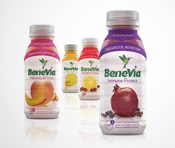
BeneVia

BeneVia Health Drink bottle

BeneVia Health Drink box
BeneVia health drink packaging by Periscope, United States.

Scrap Drives


From November 2008 until April 2009 I did extensive research on electronic waste and recycling. Based on the results of my research I developed a series of recycled USB flash drives that would inform their user of ways to recycle their electronics. Each drive included a hand-made package and digital resources. I also developed a point of purchase display, a website, a time lapse video, and a book showing my design process.

Designed by Matt Ritchie. Matt also did a website [http://attichermit.com] that teaches users about the flash drives themselves, giving a brief description of the problem, and what they could do to help.

Belle & Ella Pharmacy


Boutique pharmacy catering exclusively to women, Belle & Ella offers discreet service and modern advice from the female perspective. This prescription packaging system is a modern and elegant solution to the unattractive, cluttered packaging offered at generic drug stores. The goal was to encourage repeat use of containers and to keep personal information private when needed. These reusable aluminum containers use a peel-back vinyl label that allows medical information to be concealed, and looks unassuming when sitting on a shelf. Women can feel confident carrying meds in their purse, or leaving them out knowing that their intimate personal details are out of view.

Designed by Veronica Stark, Canada.

Wednesday, May 5, 2010

Delphic Acolyte


Delphic's Limited edition "Acolyte" CD packaging with slipcase, exclusive to HMV stores.
Designed by Non Format, United States and Norway.

Tuesday, May 4, 2010

18 Rabbits

18 rabbits snacks

When Divinely D'lish, a beloved San Francsico granola brand, decided to expand their demographic, we started at square one, devising a more authentic brand story, crafting a unique company name, as well as creating a new brand aesthetic across all products.

18 rabbits snacks orange
Based on the founder’s own experiences as a child raising eighteen pet rabbits, the goal was to make the visual identity more distinct, easily recognizable, as well as fun. The bright color palette works as a labeling system, allowing the customer to easily identify their favorite flavor on the cluttered supermarket shelves, as well as signifying what products are wheat free, dairy free...etc.


Designed by Eric Janssen Strohl, United States.

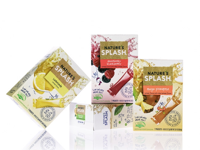
Nature's Splash

Kraft Nature Splash Drinks
Instant beverage packaging designed by NiCE Ltd.

Monday, May 3, 2010

Nature's Agave


Nature’s Agave Nectars are premium, certified organic, and made from 100% Weber Blue Agave.

Designed by The Engine Room, United States.

Thursday, April 29, 2010

Ziba


An energy / weight loss drink for the young health-nut that wants to lose weight. The packaging strip doubles as a measuring tape to track your progress and the bottle's label marks how much you should drink during your workout to stay hydrated and healthy.

Designed by Laura Berglund, United States.

Wednesday, April 28, 2010

Mugo


The perfect mash up of the 3 things you love? Well yes, if designer Aaron Atchison of Feed the Beasts’ new project Mugo, has anything to say about it. Mugo is a USB flash based MP3 player and storage drive wrapped around an urban vinyl skin by acclaimed artists such as: Julie West, Shin Tanaka, Tougui, Yup and Pulco Mayo.

The packaging emulates the product by using a blind embossed box that acts as a foundation for custom designed labels. The labels can change to mimic the character or the personal style of it’s artist.

Designed by Mugo, United States.


via lovelypackage

Omega3 Kids


Fun and unique packaging that not only attracts kids in supermarkets but also a fun way to take their fish oil supplements.
Designed by TDA Advertising and Design, USA.

Tuesday, April 27, 2010

CasaVisco Makeover Challenge Winner


This unique creation was the winner of the The Package Design Makeover Challenge. This design found the right combination of proprietary form, taste appeal, and authentic Italian ingredients to move the CasaVisco brand in a new direction.

Estudio Ray re-Branded and re-designed CasaVisco into classic containers that correspond to the hand-made quality of the sauce inside.

Designed by Estudio Ray, USA.

CareMore Invitation


This sparkling wine bottle and packaging was developed as an invitation for our healthcare client, CareMore. They are holding an awards ceremony to honor their top sales people and wanted an elegant and unique way to present invitations to the employees that were selected to attend. The awards ceremony will take place at the Encore in Las Vegas, and I decided to design a champagne invite since this was a celebration. It was also Important to incorporate the look and feel of the Encore into the presentation. The Encore resort is decorated in red butterflies and luxury furnishings, so that is the creative direction we decided to take. The bottles are packaged in a tube to match the invite.

Designed by Maranda Mitchell who is working at Traffik, USA.

Macbar


Interesting little reusable container designed by Ran Lerner.

Monday, April 19, 2010

Sinhá Vitae


The packaging was developed keeping in mind the health benefits of the product (which, not only nutritious, but also benefits the functioning of the body, improving overall health and reducing the risk of illness).
The design was created in conjunction with the Vitae brand, developed exclusively by Target Design for this product line. The heart shaped logo with unites this line with the main brand (Sinhá) which represents the idea of a product produced with care and quality, especially for the consumer.
The concept used was one of a more clean design, in line with global trends that value the white, making the information on the packaging more legible to the consumer and providing the product with a more premium position on the shelf.
Another positive feature is the enhancement of the product through the use of photos, produced especially for the package, thus providing a more immediate appetite appeal to the consumer.
Target Design was responsible for the whole process of package creation and line extension, creating not only the layout, but also all icons and graphic elements which add value to the product.

Designed by Target Design, Brazil.

Tuesday, April 13, 2010

EyePet

International packaging design company, Burgopak has won the 2010 American Package Design Award for their Sony EyePet promotional pack. The house-shaped paperboard structure features a hinged “roof” that, when opened, presents the game’s contents and actuates a pop-up of the EyePet character. The award-winning design encourages engagement between pack and user while complementing the interactive nature of Sony’s new PS3 augmented reality game.


This is the second consecutive year that Burgopak has won the American Package Design Award. In 2009 Burgopak received the award for their packaging of Target’s signature artisan chocolate line, Choxie®.
Burgopak’s London office worked on the EyePet project in conjunction with graphic and interactive design agency GR/DD, who developed the pack’s graphics and initial pop-up concept.
In order for the idea to be realised, Burgopak’s structural design team developed a simple linkage and friction lock that allows the internal surfaces to move through 90 degrees and lock to form a flat table where the contents - the game’s software, literature and hardware - are securely held. In addition to solving practical issues, the unexpected nature of the pack’s opening experience provides a well-suited introduction for Sony’s ‘augmented reality’ pet.
Graphic Design USA, a New York City based design magazine, organises the annual American Design Award competition to draw a mix of submissions in a variety of media, including print, advertising, direct mail and digital pieces.
Recently named Design Company of the Year at the UK Packaging Awards, Burgopak’s design team offers creative packaging solutions for a vast range of product areas. To find out more about Burgopak’s innovative and award-winning packaging, visit www.burgopak.com.

Friday, April 9, 2010

Pilotocopiloto


Nicolas Gjivanovic designed this sweet CD album for a Peruvian rock band called pilotocopiloto.