Showing posts with label Sauces. Show all posts

Wednesday, May 12, 2010

The Bay Tree

Bay Tree Range

Bay Tree Bottles
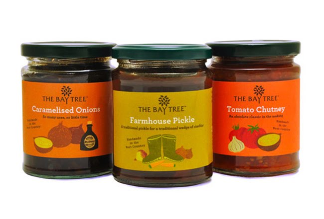
Irving have been commissioned by the founders of The Bay Tree to overhaul their complete range of food products. In short their philosophy is that The Bay Tree food products offer a ‘helping hand in the kitchen’. Products such as ready made cooking sauces, pickles and condiments help busy people save time in the kitchen. All of the products are hand made in The Bay Tree kitchens rather than processed in a large factory. The best possible ingredients are used and were possible they are sourced locally – these ingredients are often reflected on the labels. The hands-on, informal and friendly approach of the founders Emma McDonald and Lucie Lewis is reflected in the design of the labels. Irving have been working with the celebrated British illustrator Chris Brown to bring charm, wit and a distinctive personality to the brand.

Designed by Irving & Co, United Kingdom.

Monday, May 3, 2010

Nature's Agave


Nature’s Agave Nectars are premium, certified organic, and made from 100% Weber Blue Agave.

Designed by The Engine Room, United States.

Tuesday, April 27, 2010

CasaVisco Makeover Challenge Winner


This unique creation was the winner of the The Package Design Makeover Challenge. This design found the right combination of proprietary form, taste appeal, and authentic Italian ingredients to move the CasaVisco brand in a new direction.

Estudio Ray re-Branded and re-designed CasaVisco into classic containers that correspond to the hand-made quality of the sauce inside.

Designed by Estudio Ray, USA.

Sunday, March 21, 2010

Azada


Azada wants to place emphasis on the product and its Spanish origin and not on the logo itself. As such, we have decided against having the logo on the front panel as we believe it is more important to inform about the product. In order to do this, all labels are hand-written informing on how we make the oils and where we source the ingredients from. The tone of voice follows a Spanglish style that portrays our origin and the Illustrations, also drawn by hand, convey the 'natural and healthy' ethos of our brand.

Furthermore, all labels are made from natural materials (95% of sugar cane fibers and 5% of hemp and linen) and all our stationary is printed using only vegetable based inks.

Designed by Carla Marin

Sunday, March 7, 2010

Andreas Caminada


Designed by Donat Caduff, Remo Caminada & Michael Häne for Swiss Chef of the Year, Andreas Caminada. Concept by Remo Caminada.

Wednesday, January 27, 2010

Via Roma

There are 3 million people in tuscany. All different & all unique. This authentic Italian brand shows their true character, expression & emotion, in a way that has not been seen before in u.s. retail design.


This is more than just packaging, this is about how to create a total voice for a brand and bringing it to life.
Designed by United*, United States.

Sunday, November 29, 2009

Confiture et Provence


Nowadays, everything that focuses on home-made & off mass-produce is easily hearted by consumers, especially in food packaging. This strikingly simple bottle design of Confiture et Provence's Citron ginger syrup is really nice to have in your kitchen, not to mention the healthy of ginger. And the most important is we can re-use the bottle for our very own home-made syrup or as an olive oil container.

Besides the Citron ginger syrup, another nice packaging from Confiture et Provence is their SASHE (sachet) set syrup. Packed in small plastic packet of 30g each, SASHE is design for you to have a taste of over 200 different kinds of basic or a combination of two or more ingredients Confiture have. Like a palette of colors, SASHE is just lovely to have as a gifts.

Confiture et Provence produces are seasonal. They make all kinds of syrup, jam & cookies from a combination of two or more fruits, herbs, spices and alcohol. Because the ingredients use is from the period of a season, the recipe is slightly adjust to the taste of the ingredients. So every Confiture's produce is the taste of the year.

via : Design Year Book

Tuesday, November 17, 2009

Every Day Pasta Sauce


“Every Day” - Svaki Dan is brand name for tomato based, handmade pasta sauces. Client is Danubius. There are a four delicious different tastes. Concept & Design by: Peter Gregson. Illustration by: Marijana Zaric.

Thursday, October 8, 2009

Guzman Y Gomez


Sent in and designed by The Creative Method.
Bagging the Gold Pentawards 2008 and Distinction at the AGDA Awards for typography, Guzman Y Gomez is clearly on the league of its own. These packaging makes me yearn for all kinds of Mexican food even though the only thing I've ever tried was nachos...

Saturday, August 22, 2009

Tuesday, August 11, 2009

Makeover Challenge - Beach Packaging Design


This is Beach Packaging Design's entry to the Package Design Magazine’s sixth annual “Makeover Challenge.”
Consistency, simplicity, and familiarity are the keynotes of Beach Packaging Design's approach to refashioning the brand image of Casa Visco line. Gone are the variations that have crept into the style of the original packages over the product family's 51-year history. In their place is a design that's clean and direct.

After reviewing the packaging of competing brands of red pasta sauce, partners Randy Ludacer and Deborah Davis concluded that the best way for Casa Visco to stand out in this crowded category was to be "just different enough" from other brands to be intriguing—but not too different.

Although the Makeover Challenge was defined as a "blue sky" project—where one could propose just about any type of package—Beach Packaging decided to stick with glass jars. "People are comfortable with sauce in jars," Ludacer says. "We decided there wasn't much to be gained by going outside of that particular comfort zone."
"Having a bit of the product show through the spoon hole makes a nice visual metaphor for what your spoon will contain if you buy one of Casa Visco's awesome products." — Randy Ludacer
Taken from the Package Design Magazine’s “Makeover Challenge" article.

Read Rex Design's entry for the makeover challenge too and go here to vote for the one that is the most awesome!

Makeover Challenge - Rex Design


Invited by Package Design Magazine, REX Design is the first Brazilian agency to participate on the Makeover Challenge — competition provided by the mag, that selects four design agencies worldwide to develop the packaging re-design for a real brand in the marketplace.

This year, in its 6th Edition, the Challenge was to develop a new identity for Casa Visco — a traditional brand of gourmet sauces, antipasti and almonds from the US. Besides REX, other three north-american agencies are participating on the Challenge: Beach Packaging Design in Staten Island, Nova York; Estudio Ray in Phoenix, Arizona; and Queue Marketing Communications Group in Chicago, Illinois. To create the new layout, REX took a path based on the brand’s history of homemade- like production, tradition and naturalness and has developed a packaging design that builds good rapport with the consumer through a true, sincere and transparent approach. Almost like a one to one informal chat with the consumer.
We believe that a good packaging design project is no longer about how loud you can be on shelf. - Gustavo Piqueira, creative director of the project and REX’s partner.
According to the agency, the brand has been repositioned to the jar lid, surrounded by decorative ornaments. There are no labels either. Instead, the front panel displays each product information made of short sentences without marketing clichés, such as claims or appealing graphic images. On the opposite, it highlights the best on the products in a careful and humorous way. The jar copy for the sauces makes a simple statement about ingredients and their benefits, in addition to side dishes suggestions. The roasted peppers and the Jordan Almonds jars speak enticingly about serving suggestions and curiosities about their origins. With no makeups.

Read Beach Packaging Design Team's entry for the makeover challenge too and go here to vote for the one that is the most awesome!

Wednesday, July 22, 2009

Dom Diogo Oilve Oil


Designed by Michael Young and Base.
“Base, an award-winning international design firm, introduces a luxurious new matte black design to celebrate the launch of Herdeiros Passanha’s premier olive oil, Dom Diogo.

The design of the packaging is a further iteration of Base’s collaboration with Hong Kong-based designer, Michael Young, on the AIGA award-winning bottles for Passanha’s popular Quinta de São Vicente Olive Oil. The bottle silhouette represents an olive press divided into upper and lower parts by a horizontal ridge and featuring the signature drop that makes up the brand’s graphic identity. The matte black coating is complemented by a contemporary stencil typeface, a reference to the handmade tradition of the Portuguese olive oil....”

Sunday, June 28, 2009

Roger Linders


Snack sauces for kids.

Packaging design for a home brand of coffee.

Ready-to-use meat and sauce for the microwave

Designed by Roger Linders,a Dutch freelance designer with experience over 15 years of experience based in Rotterdam, Netherlands.

Tuesday, May 12, 2009

The Wooden Spoon


Designed by Simmer, specialists in food branding.
For the chutneys labels we used hand lettering that was colour-inspired by the products themselves. The colours were incorporated into the woodcuts and the black tamper seal given a subtle premium varnish highlight. The logo was strengthened and simplified, the spoon shape is introduced to support the brand story and a gold inline added to the lettering to give a more premium feel.

Monday, April 20, 2009

Mela


Also designed by Jill Brunner.
A hand-painted bottle of apple-infused olive oil made in the idyllic Italian countryside. You can check out his "BARk" packaging too!