Showing posts with label Asia. Show all posts

Monday, May 17, 2010

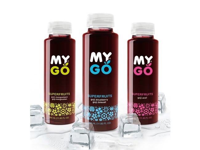
MYGO Super Fruits

MYGO is a new generation of drink, a super fruit juice, rich in antioxidants. It contains GOJI berry, an ancient Chinese medicinal fruit, often called “ the fruit of happiness”. It is believed to stimulate and boost your fundamental energy. Mygo is also rich in Vitamin C, and is a healthy and effective alternative to current energy drinks.
MYGO Super Fruits Group Shot

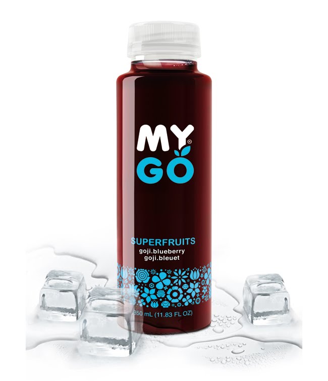
MYGO Super Fruits Blue
Delicious fruit cocktail made of a combination of Blueberry and Gojiberry, a fruit with one of the highest concentrations of vitamin C, full of nutrients and antioxidants. MYGO BLUE combines these two fruits for an intense experience. Super tasty, super vitaminized, super healthy. Known to contain high levels of anthocyanins.

Designed by B&T.

Monday, May 10, 2010

Schmoo

biz-R have recently completed a naming, brand identity and packaging project for ‘Schmoo’, a new yoghurt lassi drink.
Schmoo, a Leeds based company, plan to bring the authentic Indian lassi to the UK mainstream. The brand positions itself uniquely between smoothie and dairy (which has also formed the basis for the new name) and uses 100% pure ingredients with no preservatives - created using genuine Indian recipes.


“The identity draws influence from traditional Indian henna (mehndi) illustration but is executed in a contemporary aesthetic with a touch of modern opulence. East meets West if you will. The brand offers a clear point of differentiation from other drinks commonly sharing shelf space. An exciting, healthy product with a sense of confident sophistication - this formed the basis for our brand direction for Schmoo. The final result is both unique and eye-catching. It communicates beautifully and stands apart from anything else on the market.”

- Blair Thomson Creative Director / biz-R


The striking label design has been printed onto a silver foil stock and combined with fresh bright colours to differentiate the flavours in the range. The brand seeks to ‘shake up’ the bottled drinks sector by introducing the lassi to the mass market - which would usually be limited to specialist Asian stores and Indian restaurants.


Hayley Hadfield, Managing Director of Schmoo comments:
“From the initial brand workshops biz-R ‘got it’. They understood the essence of the brand and were not shy in coming forward with ideas. This was the confidence we were looking for and that was difficult to find with other agencies. We are really excited at the prospect of developing Schmoo together and continuing to take it forward.” Schmoo has been launched initially in Tesco stores throughout North England with plans for further expansion in the near future.

Designed by biz-R, United Kingdom.

Thursday, May 6, 2010

Green Seeds


This won Mr Jiang the Gold Prize in the Zhenhai Cup Design Competition.
The popularity of bottled chewing gums is accompanied by people 'having to' pollute the environment. Therefore, I designed a kind of gum bottle that can help people package chewed gum and throw away later -- an invention that help people achieve their environmental-friendly selves. I named it 'Green Seeds', because I believe that for the nature, less pollution equals more affection.

Designed by Gonglue Jiang.

Monday, May 3, 2010

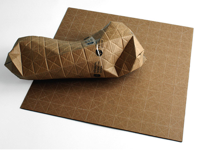
Universal Packaging System

Universal Packaging System 1

Universal Packaging System 2
Universal Packaging System 3
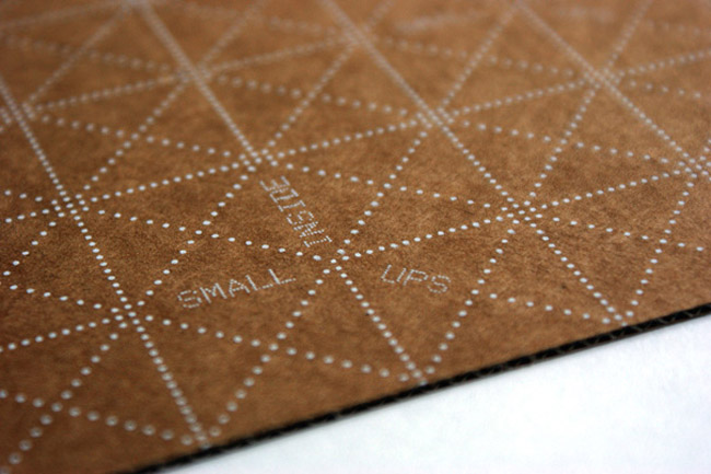
It seems a box is always too big or small so designer Patrick Sung came up with flat sheets of recyclable corrugated cardboard called the Universal Packaging System or UPACKS. The patterns make it easy to fold and conform to almost any shape while maintaining structural rigidity and protecting the contents. Love the idea of saving on packaging but will this actually work? I suspect each sheet would have to be sufficiently padded; not too thick, not too thin, but just right said Goldilocks.

Designed by Patrick Sung.
via: Yanko Design.

Babushka Anya

At the time “Babushka Anya”, one of the leading brands of the “Santa Bremor” company who operates in frozen foods industry, came to KIAN brand agency, the client viewed the brand as unmodern, without a clear identity, and being perceived by the consumer as uninteresting, correspondent to the lowest price segment.
anya frozen foods

The primary renewed visual brand conceptions for “Babushka Anya” were bright and radiant colors as well as graphic works, such as unusual shaped clear areas, positive graphics in the background, as well as creative font solutions. The redesigned trademark made the image of the personage more bright and attractive. The background drawing with the clear area is an identifier of the corporate style, and at the same time carries out the practical function of masking the small defects of the product.

Designed by KIAN Brand Agency, Russia.

Friday, April 30, 2010

PomeGreen Tea

DDC Creative Lab agency designed bottle shape and visual solution for a new product of BevMarketing Group Inc – the cold green tea containing pomegranate juice PomeGreen Tea.


The task of the agency was to create a package design, emphasizing naturalness, authenticity and individuality of the product, with reference to the traditional Eastern style.


The agency developed a low bottle, covered with shrink wrap and visual solution in fresh and emotional oriental style. Key design elements include painting, stylized traditional Chinese watercolor, juicy colors, folk motifs and Chinese calligraphy.

The work has entered a short-list of Identity: Best of the Best 2010 in the "Packaging Design" category.

Designed by DDC Creative Lab , Russia.

Tuesday, April 27, 2010

Taaza Thanda Tea


The challenge was to combine the refreshing properties of a predominantly hot beverage (tea); hence the name Taaza Thanda (that means 'Fresh & Cool' in Hindi). The typography, colour palate, dynamic use of tea leaves and the model were creatively used to depict a cool 'hot' beverage.

Designed by DMA Yellow Works, India.

Thursday, April 15, 2010

Suntory Hibiki 12 Gift Pack

Suntory needed a gift pack to promote the mix of their new whisky ‘Hibiki 12 Years’ and ‘Perrier’.
The gift pack was distributed at Suntory whiskey trial events to guests who were interested in something other than just straight whiskey.
‘Hibiki’s’ core creative idea is ‘The Dramatic Blend’, based on the whiskey’s young energetic blending. The gift pack therefore had to have a dramatic feeling and effect on opening. Also including the ‘Purple Ribbon’ the brand icon.


In Japan the ‘Furoshiki’ is a traditional gift, which is constructed with a cloth wrapping much like a hamper. Using that as a basis we constructed a box tied up with an elegant ribbon that represents the brand. After the ribbon is untied and the top removed the gift pack opens dramatically like a flower. Which is a reference to the fragrance of the product and also to the packs momentary existence.


Designed by Alex Noble, who is working at Ogilvy & Mather Tokyo.

Taj Mahal Tea


DMA Yellow Works was contacted by Hindustan Unilever Ltd. to redesign the packaging for Taj Mahal Tea. The brief was to create an aura of superior tea. DMA Yellow Works achieved this via design as well as selection of metallic substrates. The result was 18% improvement in volume and off take (excellent response from consumer).

Designed by DMA Yellow Works, India.

Friday, April 9, 2010

Yarmarka Platinum

"Platinum” is a unique brand on the Russian market. This was the first company to offer consumers rare forms of hulled grains and beans, as well as original mixes brought from different corners of the world. In terms of diversity of exclusive positions and width of assortment in the brand, “Platinum” has no parallels in Russia and CIS.


On the preliminary stage of the project, KIAN brand agency, together with representative of the “Yarmarka” company, worked on shaping and detailing the package of the product. In order to implement a solution for creating brand identity, a bonus image was created, providing minimal design with simple font yet with powerful visual identifiers present.

The most important part in package design is the visual image of the product-attractive and absorbing grains in unusual shapes and colors, placed to create the visual of simple and positive graphic symbols. This decision allowed the creation of an effective product navigation system: each product category was given its own graphic image, identifying the category not only visually, but on an emotional level as well. The goal of identifying the different mixes the company sell was solved by using a complex figure, created from petals, of which each one represented an ingredient in the mix.

As a result of the changes implemented, a more modern and attractive image was created, allowing the brand to establish a bold and colorful presence on store shelves, leading to its product standing out from competitors and sales being realized without the investment into new marketing or commercials.
Awards : Gold Pentawards 2009, Silver ADCR Awards 2009, Silver Kiev International, Advertising Festival 2009, Bronze Red Apple 2008.

Designed by KIAN brand agency, Russia.
Yarmarka Café

KIAN brand agency serves the entire portfolio of brands of the “Yarmarka” company, perhaps the most dynamic and innovative company on the Russian grocery market for the past few years. In the spring of 2010 a new brand of the Company was entered into the market. Under this trade mark Customer produces a very interesting and, as a tradition, absolutely new for the Russian market product. It is a unique collection of mixes for delicious and interesting dishes such as polenta, paella, risotto, couscous, emmer, etc. It is offered to consumer not only a quick food, but also a product that helps to express their creative abilities and realize their culinary talent giving scope for fantasy.


It was selected a conception of a comfortable café as a place where you can not only have a bite quickly and tastefully but also have a good time. Selected name – Café – perfectly opens the brand conception and creates a certain tint of preciosity and European style.


Visual brand identity was realized in a conception of eco-design and intended to convey the mood of naturalness, warmth and comfort. Grapheme of the brand and graphic surrounding imitate natural products. Product zone of the package creates a sense of the cooking process. Special attention in the development of package design was focused on a design of back label that is the main tool of communication with consumer in this project. It offers them information about the brand, product and the process of its preparation, etc. The cooking recipe is made in the main “hand made” style and stylized as a piece of a cookbook with handwritten notes and lovely color drawings illustrating the process of cooking.

Designed by KIAN brand agency, Russia.
Rice Terraces Pack (Student Work)

Rice is the primary food for more than 3 billion people around the world and one of the basic products that the human society consumes.
But how much do we know about rice?


The Structure is based on the principle of returning to nature, the natural shape of the terrace is the main Inspiration.
The multi packaging resembles the movement and the pace of the terraces.
The second goal is to increase knowledge about rice by using info-graphics and data on packaging to answer people’s questions.


Designed by Amit Sakal, a 3rd Year visual communication Student In Shenkar College, Israel.

Sunday, April 4, 2010

Pelter Winery


The distinctive visual language has significantly helped to transform Pelter Winery’s market image. Starting as a small local winery, Pelter’s wine is now exported worldwide and available in over 20 Michelin starred restaurants.

Designed by Dov Kroll, Israel.

Wednesday, March 31, 2010

Divine


The packaging for these yummy handmade treats reflects the peaceful rolling hills, pure skies, and timeless olives groves from which they originate. Heavenly? Definitely. The Terra Cotta cruet that contains these Divine Olives has a hundred-and-one-uses and like the label, string, cork lid, wooden beads and wax seal; will biodegrade. The terrific and talented Lydia Leith made the illustration come to life. The words come from the great John Archer.

Designed by Scott Lambert.

Sunday, March 21, 2010

Gerblé Japon


New packaging identity to convey "the art of living" image of South of France percieved by the Japanese. Designed by Cartoon Design, France.

Clean Clothes for Dirty People (Student Work)


This is a Laundry detergent packaging concept, designed for a class assignment under the "One of many" idea, so you can take home not just a box, but a part of an experience.
This great laundry detergent is to be sold on those every-day laundromats, designed for young, fun-loving, mess-making kind of people, living on their own.
The concept is "Clean Clothes For Dirty People" - inspired by the washing machine drum structure, soap bubbles, new found sexy chic of laundromat and urban living.

Designed by Lee Coren, a 3rd year student at Shenkar College of Engineering and Design, Israel.