Showing posts with label Alcohol. Show all posts

Tuesday, May 18, 2010

Cascade

Cascade is Foster’s third-largest beer brand and is brewed in Australia’s oldest brewery at the base of Mount Wellington in Tasmania. The Cascade beer portfolio—made up of two premium beers (lager and light) and three craft beers (blonde, pale ale, and stout)—was fragmented and lacked visual consistency. Cascade’s portfolio volume was also dominated by Cascade Premium Light, which was competing in a declining market. On the whole, Cascade had lost relevance in the competitive premium beer category and needed to redefine itself as a more contemporary, unified brand.
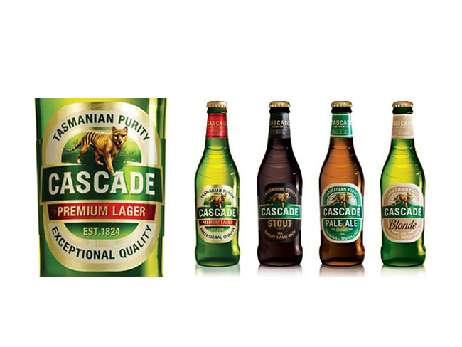
Cascade group

Landor’s task was to create a new brand positioning and architecture for Cascade, allowing for the development of a clear master brand strategy that would be implemented across the portfolio. The challenge was to give Cascade a contemporary look and feel and to ensure that the brand continued to embody its uniqueness through all touchpoints. From Landor this required a deep understanding of—and passion for—the Cascade brand and premium beer category combined with a highly creative design strategy and execution.
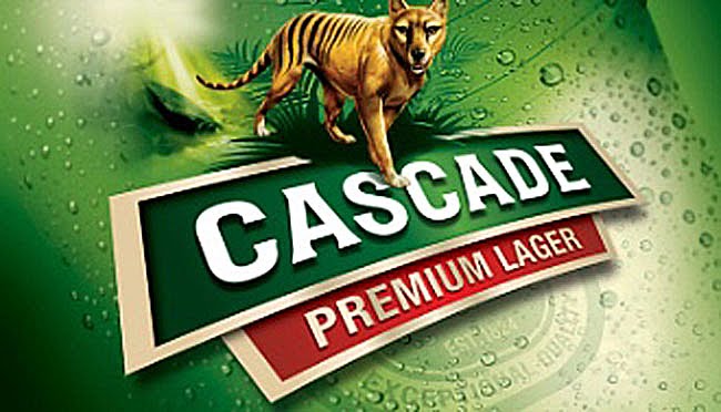
Cascade label
From the heart of the brand essence—untamed soul—Landor and the Cascade team reclaimed the Tasmanian tiger as the leading icon for the brand. The tiger provided clarity for Cascade and a direction for all aspects of design—bottle and can graphics and structure, secondary packaging, guidelines, and point-of-sale and merchandising collateral. Portfolio alignment was achieved through a master brand approach that created a unified visual identity eliminating the brand’s fragmentation. Landor also used on-premise merchandise to lay the foundation for future brand building. In 2008, the design was recognized with an Australian Packaging Award.

Designed by Landor, Australia.

Monday, May 17, 2010

Septiembre


Bodegas Trapiche commissioned Tridimage to renew the brand image and packaging of their cool wine September, one of the leaders of the Argentine market. Based on the concept of "Spring night" the flower icon builds colorful patterns in each label.

Designed by Tridimage.

Sunday, May 16, 2010

Ipacs Winery

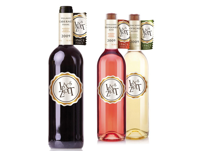
Ipacs Winery is a young, emerging, dynamic developing and already successful winery led by an ambitious owner.
ipacs winery wine bottles

Our task was to design the CI and the packaging for the winery. Neither the package-technology nor the budget of Ipacs can rival with the historic wineries. Thus the designer's goal was to make advantage of the disadvantage. The quite unusual flag-like label was born thanks to this pressure. The label holds all important information so the tag on the bottle could concentrate exclusively on the branding.

Designed by Café Design, Hungary.

Wednesday, May 12, 2010

Preece


Australia’s leading illustrators were commissioned to create artworks inspired by the Mitchelton winery in central Victoria for the latest Preece re-branding. The rejuvenation has elevated Preece into the top 50 best selling wine brands in Australia.

Packaging by Frank Aloi, Australia. It is the finalist at the AGDA Awards.

Monday, May 10, 2010

Vinhos Lagosta


Pitch proposal for the re branding & new packaging of Rosé & Vinho verde of Lagosta Wines. Lagosta (Lobster) is a fresh summery wine that goes well with all kinds of fish and sea food.


The proposal of the bottle aimed to recreate and modernize the traditional "Mateus Rosé" bottle while aiming for a more sophisticated audience.

Concept by Rui Granjo, Portugal.

Sunday, May 9, 2010

Stiegl (Student Work)

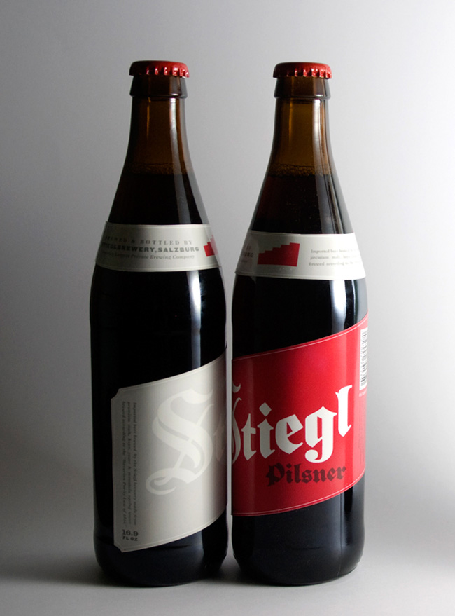
Introducing a beer into an already saturated market a difficult task, but when the beer brand has such a rich history it’s a little easier to distinguish it from the competition.
Stiegl beer close up

Retaining the brands extensive elements; bold blackletter logo treatment, the staircase icon, and deep crimson red kept the familiarity within the brand. But updating and incorporating new elements; such as the diagonal rising label that mirrors the upward motion of the staircase logo, brings a contemporary feel to the traditional brew.
Stiegl beer group shot
Designed by Richard Perez of Skinny Ships. This is one of his academic projects.

Wednesday, May 5, 2010

Gyulai Palinka Spirit

The original 'pálinka' is a distilled spirit made of fermented fruits.
Only those products can be referred to the 'pálinka' which are made from
Hungarian fruits, have 100% fruit content and got 37,5% of alcohol strength
as a minimum.
gyulai_palinka bottle

The first distillery in Gyula was founded by János György Harruckern in
1731. This nearly 300 year-tradition is carrying on by Gyulai Pálinka
Manufacture (in these days).

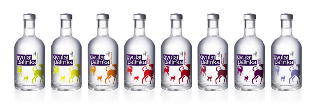
gyulai_palinka bottle range
The task was to create a new packaging design which focuses to the mature
young generation. The key motive of the new design is the Hungarian hound,
which is fidelity, nobility and got all the traditional values.

Designed by Peter Berki of Café Design, Hungary.

Monday, May 3, 2010

Phillips Bonafide Originals

From formulating America’s first schnapps to pioneering flavored vodka, the Phillips family has been crafting innovative spirits for five generations. Approaching their 100th anniversary in 2012, Minneapolis-based Phillips Distilling Company is reissuing some of their classic brands as they first appeared in their original, collective packages – aptly named the Bonafide Originals.


Consumers can find the re-introduced Phillips Peppermint Schnapps as the first of the original Phillips Vodka on liquor store shelves throughout the Upper Midwest, using the same bottle and label when the liquor debuted in 1935. The other labels -Phillips Gin-Ka, Phillips Sno Shoe Grog will follow shortly. This vintage approach to bottle appeal not only showcases the rich history of Phillips Distilling Company, but of Midwestern traditions.


Phillips brands like Peppermint Schnapps and the rest of the Bonafide collection are deeply rooted in Midwest tradition – some still resting quietly in lodges, liquor cabinets, taverns and tackle boxes across the Upper Midwest. There’s been a story in every bottle. The Bonafide Collection promises to reignite past memories and create new ones with a whole new generation of imbibers.


The Bonafide Originals Logo was done by Brew in Minneapolis. Marla Teich, designer at Phillips Distilling Company, created a commemorative gift box as well as a brochure celebrating the vintage appeal of this unique packaging design.

Thursday, April 29, 2010

Balblair


Nice little scotch whiskey packaging designed by NTGJ, Portugal.

Wednesday, April 28, 2010

Breuckelen Gin


Breuckelen Distilling Company asked us to work with them on the branding of their new bottles and packaging.

Breuckelen Distilling is an artisan distillery located in Brooklyn, New York. They handcraft delicious gin from organic New York grains entirely within their Brooklyn location. Breuckelen is a tiny fraction of the size of typical distilleries but their production methods create products of the highest quality.

Breuckelen’s founder, Brad Estabrooke, is an ordinary guy with an extraordinary love of distinctive wines and spirits. He began studying the art of distilling almost two years ago now, and his passion for it has grown exponentially since his studies began.

Designed by I love Dust, UK.

Tuesday, April 27, 2010

CareMore Invitation


This sparkling wine bottle and packaging was developed as an invitation for our healthcare client, CareMore. They are holding an awards ceremony to honor their top sales people and wanted an elegant and unique way to present invitations to the employees that were selected to attend. The awards ceremony will take place at the Encore in Las Vegas, and I decided to design a champagne invite since this was a celebration. It was also Important to incorporate the look and feel of the Encore into the presentation. The Encore resort is decorated in red butterflies and luxury furnishings, so that is the creative direction we decided to take. The bottles are packaged in a tube to match the invite.

Designed by Maranda Mitchell who is working at Traffik, USA.

Thursday, April 15, 2010

Suntory Hibiki 12 Gift Pack

Suntory needed a gift pack to promote the mix of their new whisky ‘Hibiki 12 Years’ and ‘Perrier’.
The gift pack was distributed at Suntory whiskey trial events to guests who were interested in something other than just straight whiskey.
‘Hibiki’s’ core creative idea is ‘The Dramatic Blend’, based on the whiskey’s young energetic blending. The gift pack therefore had to have a dramatic feeling and effect on opening. Also including the ‘Purple Ribbon’ the brand icon.


In Japan the ‘Furoshiki’ is a traditional gift, which is constructed with a cloth wrapping much like a hamper. Using that as a basis we constructed a box tied up with an elegant ribbon that represents the brand. After the ribbon is untied and the top removed the gift pack opens dramatically like a flower. Which is a reference to the fragrance of the product and also to the packs momentary existence.


Designed by Alex Noble, who is working at Ogilvy & Mather Tokyo.

Thursday, April 8, 2010

BOOM TOWN Mix Pack (Student Work)


This project recently won a Regional Gold Addy Award, a Local Gold Addy as well as Best of Show in the Oklahoma region. This BOOM TOWN Mix Pack is a high ABV 4 pack that reflects the San Francisco Gold Rush. Each of the 4 beers has a different name of a boomtown from California. Names like Gouge Eye Double IPA bring instant imagery to mind.

Designed by Kyle Ramsey, a recent graduate from the University of Central Oklahoma.

Sunday, April 4, 2010

Pelter Winery


The distinctive visual language has significantly helped to transform Pelter Winery’s market image. Starting as a small local winery, Pelter’s wine is now exported worldwide and available in over 20 Michelin starred restaurants.

Designed by Dov Kroll, Israel.

Wednesday, March 31, 2010

Stock Prestige


The product strategy was to create a pure vodka - one defined by exclusivity and luxury - within the world-famous Stock brand, which, in Poland, had previously only been associated in with a popular brandy. The label, comprised of the main brand characteristics, was placed on the upper part of the bottle in order to highlight the specially-designed bottle's "multiple-reflection" effect.

Designed by BrandyDesign, Poland.

Friday, March 26, 2010

Pravda Vodka


Polish Vodka packaging designed by Samantha Ziino.

Monarchia Matt


Various Polaner Selections wine label designed by Jessica Hische and Louise Fili while working at Louise Fili Ltd., each with a ton of hand-lettered type.

Gin Mare


The Design Studio SeriesNemo (Barcelona) wants to present its latest product design, Gin Mare - The first and only Mediterranean gin. Gin Mare has been awarded with one BESTPACK (Alimentaria 2010) and one WORLD SPIRITS COMPETITION (International Competition in San Francisco).
The design of the bottle combines the straight and curvy ways with white and blue reflexes that suggest a synthesis between sea and sky, water and foam.
A singular bottle stopper wraps all the neck of the bottle strengthening thus its Premium character.

Mixed Emotions (Student Work)

The idea of this project is to sell emotions through a product. I selected a mix between a concoction and vodka. The concoction is a fruit blend that contains emotions such as love, sadness, happiness, fear and anger. The Mixed Emotions cocktail evokes an emotion and changes your attitude according to your preference.


The spiral structure forms two straws that invite the consumer to visualize how the liquids combine as they drink. Two tiny mecanisms outline the straws to bottom of the container, allowing air to enter and hence permitting the customer to absorb the liquid. The cap provides an air-tight seal, thus enclosing all openings.


While the front panel invites the consumer to drink, the back panel depicts phrases to illustrate the type of experience the customer will encounter. Because of its design, the consumers can dance, jump, go wild or do whatever they please without worrying about spilling their drink or breaking the bottle.


Designed by José Luis García Eguiguren, a student studying at Elisava Escola superior de disseny in Barcelona, Spain.