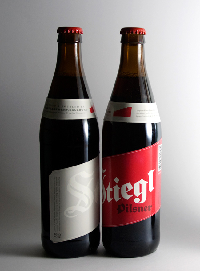
Introducing a beer into an already saturated market a difficult task, but when the beer brand has such a rich history it’s a little easier to distinguish it from the competition.

Retaining the brands extensive elements; bold blackletter logo treatment, the staircase icon, and deep crimson red kept the familiarity within the brand. But updating and incorporating new elements; such as the diagonal rising label that mirrors the upward motion of the staircase logo, brings a contemporary feel to the traditional brew.

Designed by Richard Perez of Skinny Ships. This is one of his academic projects.
No comments:
Post a Comment