Showing posts with label Food. Show all posts

Monday, May 17, 2010

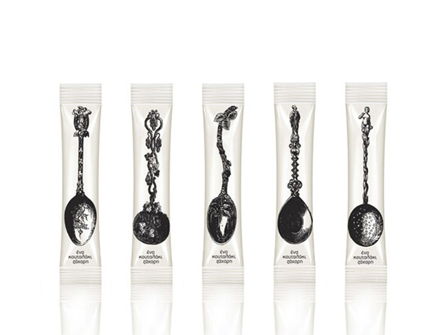
A Teaspoon of Sugar

mouse graphic sugar packaging
Latest work by Mouse Graphics, Greece.
This work is a conscious attempt to literally interpret the pack content: 'One spoonful of sugar' - visually and verbally stated. Straightforward and simple, the pack design obviously invites to a more decorative daily cupper.

Monday, May 3, 2010

Babushka Anya

At the time “Babushka Anya”, one of the leading brands of the “Santa Bremor” company who operates in frozen foods industry, came to KIAN brand agency, the client viewed the brand as unmodern, without a clear identity, and being perceived by the consumer as uninteresting, correspondent to the lowest price segment.
anya frozen foods

The primary renewed visual brand conceptions for “Babushka Anya” were bright and radiant colors as well as graphic works, such as unusual shaped clear areas, positive graphics in the background, as well as creative font solutions. The redesigned trademark made the image of the personage more bright and attractive. The background drawing with the clear area is an identifier of the corporate style, and at the same time carries out the practical function of masking the small defects of the product.

Designed by KIAN Brand Agency, Russia.

Monday, April 19, 2010

Sinhá Vitae


The packaging was developed keeping in mind the health benefits of the product (which, not only nutritious, but also benefits the functioning of the body, improving overall health and reducing the risk of illness).
The design was created in conjunction with the Vitae brand, developed exclusively by Target Design for this product line. The heart shaped logo with unites this line with the main brand (Sinhá) which represents the idea of a product produced with care and quality, especially for the consumer.
The concept used was one of a more clean design, in line with global trends that value the white, making the information on the packaging more legible to the consumer and providing the product with a more premium position on the shelf.
Another positive feature is the enhancement of the product through the use of photos, produced especially for the package, thus providing a more immediate appetite appeal to the consumer.
Target Design was responsible for the whole process of package creation and line extension, creating not only the layout, but also all icons and graphic elements which add value to the product.

Designed by Target Design, Brazil.

Tuesday, April 13, 2010

Avonmore


Avonmore is the current number 3 selling grocery brand in the country so we were only too aware of the potential impact that a packaging overhaul can create. The project ambition was to unify Avonmore's broad portfolio. while allowing each product brand to have its own character and individuality.

Designed by Dynamo, Ireland.

Friday, April 9, 2010

Yarmarka Platinum

"Platinum” is a unique brand on the Russian market. This was the first company to offer consumers rare forms of hulled grains and beans, as well as original mixes brought from different corners of the world. In terms of diversity of exclusive positions and width of assortment in the brand, “Platinum” has no parallels in Russia and CIS.


On the preliminary stage of the project, KIAN brand agency, together with representative of the “Yarmarka” company, worked on shaping and detailing the package of the product. In order to implement a solution for creating brand identity, a bonus image was created, providing minimal design with simple font yet with powerful visual identifiers present.

The most important part in package design is the visual image of the product-attractive and absorbing grains in unusual shapes and colors, placed to create the visual of simple and positive graphic symbols. This decision allowed the creation of an effective product navigation system: each product category was given its own graphic image, identifying the category not only visually, but on an emotional level as well. The goal of identifying the different mixes the company sell was solved by using a complex figure, created from petals, of which each one represented an ingredient in the mix.

As a result of the changes implemented, a more modern and attractive image was created, allowing the brand to establish a bold and colorful presence on store shelves, leading to its product standing out from competitors and sales being realized without the investment into new marketing or commercials.
Awards : Gold Pentawards 2009, Silver ADCR Awards 2009, Silver Kiev International, Advertising Festival 2009, Bronze Red Apple 2008.

Designed by KIAN brand agency, Russia.
Yarmarka Café

KIAN brand agency serves the entire portfolio of brands of the “Yarmarka” company, perhaps the most dynamic and innovative company on the Russian grocery market for the past few years. In the spring of 2010 a new brand of the Company was entered into the market. Under this trade mark Customer produces a very interesting and, as a tradition, absolutely new for the Russian market product. It is a unique collection of mixes for delicious and interesting dishes such as polenta, paella, risotto, couscous, emmer, etc. It is offered to consumer not only a quick food, but also a product that helps to express their creative abilities and realize their culinary talent giving scope for fantasy.


It was selected a conception of a comfortable café as a place where you can not only have a bite quickly and tastefully but also have a good time. Selected name – Café – perfectly opens the brand conception and creates a certain tint of preciosity and European style.


Visual brand identity was realized in a conception of eco-design and intended to convey the mood of naturalness, warmth and comfort. Grapheme of the brand and graphic surrounding imitate natural products. Product zone of the package creates a sense of the cooking process. Special attention in the development of package design was focused on a design of back label that is the main tool of communication with consumer in this project. It offers them information about the brand, product and the process of its preparation, etc. The cooking recipe is made in the main “hand made” style and stylized as a piece of a cookbook with handwritten notes and lovely color drawings illustrating the process of cooking.

Designed by KIAN brand agency, Russia.

Rice Terraces Pack (Student Work)

Rice is the primary food for more than 3 billion people around the world and one of the basic products that the human society consumes.
But how much do we know about rice?


The Structure is based on the principle of returning to nature, the natural shape of the terrace is the main Inspiration.
The multi packaging resembles the movement and the pace of the terraces.
The second goal is to increase knowledge about rice by using info-graphics and data on packaging to answer people’s questions.


Designed by Amit Sakal, a 3rd Year visual communication Student In Shenkar College, Israel.

Monday, April 5, 2010

Twigs Plant Boutique


Twigs Plant Boutique is a company that specializes in plants for the home. This 'gourmet' line which features herbs and spices is perfect for the heart of the home-- the kitchen. The line consists of gourmet plant food, seeds for planting and pre-planted seeds that come in a biodegradable containers which can be placed in the soil to decompose. It is inspired by olive oil and vinegar bottles and the traditional design aesthetics that come with modern packaging of cooking-ware. The vibrant leaf-shaped images resembling a plant provoke feelings of a happy home with scenes of spring, gardens, flowers, etc.

Designed by Lindsay Perkins, a recent graduate of the Savannah college of Art and Design.

Wednesday, March 31, 2010

Divine


The packaging for these yummy handmade treats reflects the peaceful rolling hills, pure skies, and timeless olives groves from which they originate. Heavenly? Definitely. The Terra Cotta cruet that contains these Divine Olives has a hundred-and-one-uses and like the label, string, cork lid, wooden beads and wax seal; will biodegrade. The terrific and talented Lydia Leith made the illustration come to life. The words come from the great John Archer.

Designed by Scott Lambert.

Sunday, March 21, 2010

Gerblé Japon


New packaging identity to convey "the art of living" image of South of France percieved by the Japanese. Designed by Cartoon Design, France.

Wednesday, March 3, 2010

Bureau of the Year 2010


Packaging design for "Bureau of the Year 2010" in Sweden. A competition where advertising-, media and design bureaus compete against each other based
on clients' evaluations.

The event is sponsored by a printing company called Elanders. That allowed us to be more creative when it came to printing techniques. This series
has partial gloss, 400 dpi raster on wood textures, silver foil and high quality paper to represent some of Elanders printing possibilities.

Designed by Milk, Sweden.

Tuesday, February 23, 2010

Christopher & Mason


The artistic middle and lower class really need a brand of grocery they can identify and trust when browsing the aisle. Christopher and Mason looks to connect with certain people who appreciate great graphics but are not necessarily looking to pay for it. Christopher and Mason is printed on simple craft paper using only 2 colors (not spot) to keep costs down and be eco-friendly at the same time.

Designed by Alexis Champa

Monday, February 22, 2010

Raw Health


New brand creation. Redefining the raw food movement, taking it from niche to a universally understood and accepted concept.

Designed by Pearlfisher, United States.