


Momiji packaging range consisting of message dolls, mugs and hand-held mirror, all designed by Pounce, United Kingdom.


I created this series of animal illustrations as a side project, now I have developed a brand for them called 'Woodland Creatures'. I illustrated a set of 5x7 postcards, then designed a logo and a package to carry the cards.

Randstad was the first Dutch employment agency to recognise brand communication and design as a way of building business. Rethinking the corporate vision and brand promise in 2001, Randstad concluded that while its core values continue to be valid, the expression of its brand identity was outdated. They selected Studio Dumbar to revitalise the brand and make it suitable for worldwide application.
Studio Dumbar created a design system entirely based on proportion, not size, including a style guide for the design of web sites, interior fittings, exterior signage for Randstad branch offices, and fleet marking.
Through international takeovers, Randstad is expanding its service package to HR solutions as well as recruitment and selection. That’s why Studio Dumbar created sublabels of the Randstad brand. The label styles fit in the Randstad design system but have their own character due to colour use and matching photography.


Crayola has a lot of brand equity in their color names. I wanted to create a series of packaging (here: forest green, mod magenta, and purple mountain magesty) which playfully accents these color names.


This fruit-inspired packaging can be used as a box or tray for products and food. This is just a prototype, but we have made small (5 – 10 cm) and large (15 – 30 cm) versions for different uses.


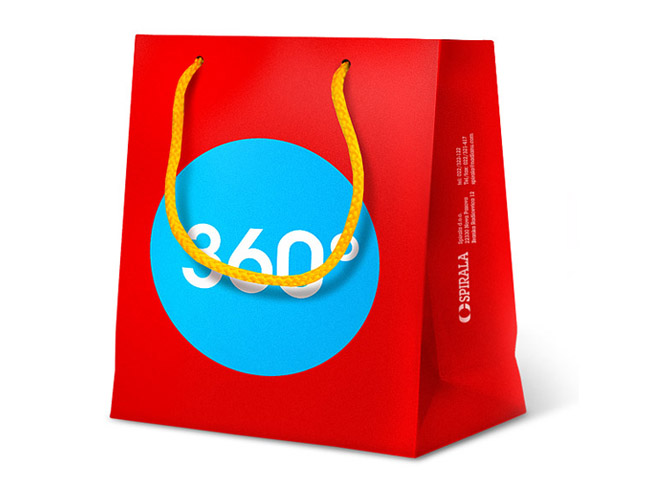
Promo material for “SPIRALA” - company specialized for spiral binding. We design small paper bags for presents and notebooks in similar style, which will have die cut on cover and it will be binded with hidden spiral system (we will show them after they are printed).

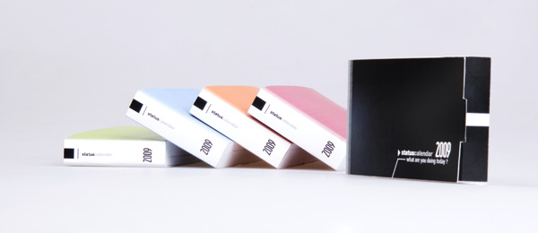

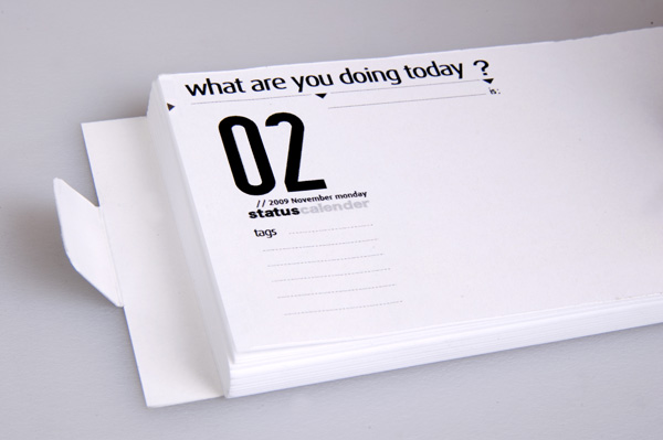

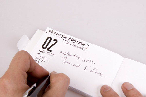
The web's big question " What are you doing right now? " is incredibly useful for tracking your daily activity.
This is a calendar where you can write your daily "status".
It simply asks the question, "What are you doing Today?"
And you are invited to answer it!


Challenge
Askul is one of Japan’s fastest growing companies, a mailorder business with a selection of over 25,000 products and 24-hour service to the whole country. Among its product you can find everything from furniture and computers to food and office supplies. The problem was that Askul’s own brand of products was not highly visible in the product catalogue, which negatively affected sales.
Solution
With Scandinavian design as a starting point the products' common denominators are function, simplicity and clear communication. The typography has distinctive elements of colour and graphics, which makes the packaging eye-catching within both the extensive catalogue, and the home or office environment.
Result
An increase in sales and recognition of the newly designed products.


“Grass” squares are designed to give a natural touch to the office or home by placing them freely or according to feng-shui. Unlike ordinary flowers, “grass” is completely natural, a piece of earth, that grows indoors with minimal care.
Inspired by Frank loyed Wright’s Fallingwater and the attempt to combine architecture and nature, the entire project is made from recycled materials and tries to merge the home with the outdoors.
The packages have an air opening to gain longer shelf live for the product.
The minimalistic design and logo is intended to give a flowing, “breathing” feel to it, as well as elegance and life-style.


