Monday, August 31, 2009

Calpis


Thanks to Miko san for sending in these awesome pictures and information. どうもありがとう!

Calpis (カルピス, Karupisu) is a Japanese uncarbonated soft drink, manufactured by Calpis Co., Ltd. (カルピス株式会社, Karupisu Kabushiki-gaisha?) , headquartered in Shibuya, Tokyo.
CALPIS is made from non-fatted milk . The milk is fermented slowly by adding microorganism including lactobacillus unique to our company and kept on using for a long time. The cultured milk produced in such manner is called Calpis Cultured Milk.

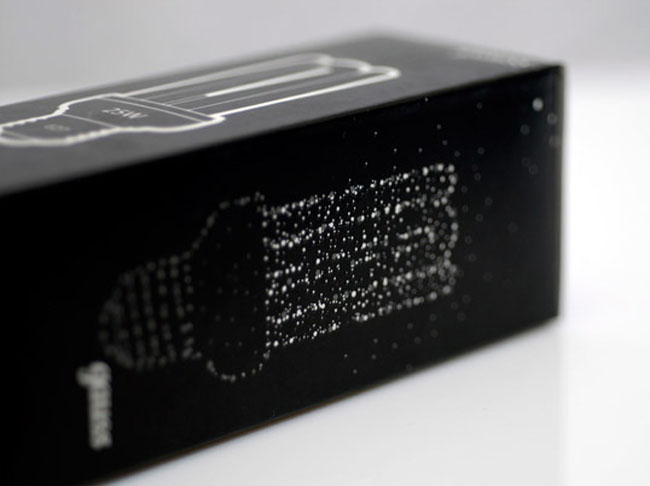
CALPIS was launched on July 7 1919, on the day of Tanabata Festival (Star Festival).
In some countries in Asia including China and Japan, there is a custom to see stars in "Milky Way" on this day. The design of "polka-dot pattern" on the package of CALPIS is inspired by the image of stars in the "Milky Way" as the product was launched on the day of Tanabata.
The original pattern was white dots on blue background. It was changed to blue dots in white background later. The pattern is praised as an excellent design that can communicate the refreshing image of CALPIS and retain a sense of freshness after all those years and loved by many customers.


The trademark of polka-dot pattern is featured in all CALPIS brand products available in Japan and all over the world.

Designed by Taku Satoh Design Office.

MIAD student work

MIAD packaging

MIAD packaging
MIAD packaging
MIAD packaging
MIAD packaging
MIAD packaging
MIAD packaging
Students in the Communication Design program at the Milwaukee institute of Art & Design were asked to visit Lotions and Potions, create a fragrance and then visually theme the fragrance via naming, mood boards, typography and packaging design. Visit www.miad.edu to find out more about the Communication design BFA at the Milwaukee Institute of Art and Design.

Kaffe

kaffe cup

kaffe bag
kaffee card
"Kaffe is a coffee shop started by 4 swedes. The handwritten charcoal aesthetic derives from the personal connection every person has with their type of coffee. This is reflected in a direct style of communication with business cards, bags, take away cups etc. personally addressing the customer."
Designed by Felix Lobelius [via friendfeed]

Merrick


Merrick challenged us to design the new high end packaging around their alternative dog food, and we saw an opportunity to transform the funtional level of clean to an aspirational experience that truly resonated with Merrick's female consumer. We created "counter top" worthy designs that leveraged the Merrick Brand.

Designed by 29 Agency.

Saturday, August 29, 2009

Niagara


Hattomonkey has created the packaging design of mineral water “Niagara”. The brand mark looks like waterfall – inexhaustible stream of pure water. The solution is simple and laconic, which is to underline the natural characteristic of the product.

Friday, August 28, 2009

INQ¹

Designed and illustrated by the very famous Yuko Shimizu. She is a freelance illustrator based in New York City and an illustration instructor at School of Visual Arts. Newsweek Japan has chosen her as one of "100 Japanese People The World Respects" in 2009.


At INQ we make a new type of handset - the Social Mobile - designed for the way people communicate today. The services we’ve built into the device are there to be used, and not sit stranded and unwanted in some obscure sub-menu.

Communication is at the heart of everything we do. We express this in our brand through one of its most striking and creative aspects: art. Not in any lofty way, but in vibrant and streetwise forms: illustration, comics, film - whatever we like really, whatever catches our eye.


With the INQ¹ box we wanted to create an object of beauty - something to cherish not chuck. All too often, packaging needs up in landfills, or recycling bins at best. While we’d like people to keep it, use it and treasure it.

When we design our handsets we remix and edit internet services so that the play best on a mobile. Similarly, we remixed the idea of a box and made it into a place to display artwork. The box art, and the illustrations on the help cards, come from people whose work we really like.
-INQ

Thursday, August 27, 2009

Chötkaya Vodka

chotkaya 1

Chötkaya Vodka - is brand new Russian vodka preparing to be manufactured. I was asked to think over the idea of it and make the whole design, including logotype, bottle & pack and a promotional web-site (http://chotkaya.ru) with a "moveyourmouse" interface.
In the beginning i had only the name "Chotkaya" wich means: clear, legible, accurate, exact, distinct - in Russian. And below is what i made from this word.

chotkaya 2
chotkaya 3
chotkaya 4
Designed by Boris Kuznetsov.

Nostalgia Organics

Nostalgia Organics' products are made with antioxidant-rich fruit, nut and herb oils sourced both locally and from places as far away as Bulgaria and France. Each collection is enhanced with aromatic plant oils carefully considered for their aromatherapy and skin-nurturing benefits.
Nostalgia Organics 1
Butter Mints,Nostalgia's newest bar soap.

Nostalgia Organics 2
Gold starlets shining on the new aromatherapy balm packaging
Nostalgia Organics 3
New aromatherapy balm packaging
Nostalgia Organics 4
Botanical soap collection
Nostalgia Organics 5
Tiny satin ribbon

Muymuy

Very cute milk package concept designed by isleepbetter, it comes with a four pack set.
Sticker label
Sticker label

Muymuy milk, front labels
Muymuy milk, 4 pack
Muymuy milk, 4 pack
Muymuy milk, back labels

Gauss Lamps

gauss 1

gauss 2
gauss 3
gauss 4
Designed by Fastway.
“The objective was to create package for power saving lamps which considerably would differ from all other packages of the lamps presented in retail networks. Besides, it was necessary to show that Gauss lamps are the premium-segment, having justified, thus, their higher than at the majority of competitors price.

The main idea of the package – minimum superfluous, but maximum sense and convenience. On the face side – only a lamp category, its appearance and key parameters of choice. To attract more attention some objects (dots, lamp) were UV-lacquered.”
via : lovelypackage

Holli Mølle


Strømme Throndsen Design created the brand identity and packaging for Holli Mølle, an Organic Flour company. This design is awarded the Norwegian Design Council Award for design excellence.
Holli Mølle is a small organic mill in Eastern Norway, specializing in flour production with the use of ancient and nutritious grain types. The target audience is modern women who value health and nutrition and are willing to pay extra for the safety and taste of organic flour, thereby providing them with an extra feeling of love and care for their family.

In creating the name, visual language and packaging for Holli Mølle, the following criteria were highlighted:
  • The identity should be based on traditional and authentic values.
  • The packaging should be environmental friendly, functional, flexible and efficient in production.
  • The identity should challenge the existing visual language in the flour category.


The result is a simple and unique graphical design, with fresh colours on the labels as the only differentiator between the 6 variants. The design communicates well with the target group, giving them a feeling that the flour really is 'ground with love', as stated on the packaging in the personal message from the owner, Trygve Nesje."

Landgarten Gläser

Landgarten Gläser
Designed by d.signwerk for Bio Snacks.

Antoine Amrani Chocolates

Antoine Amrani Chocolates 1

Antoine Amrani Chocolates 2
Antoine Amrani Chocolates 3
Smith Design’s charge was to position Antoine Amrani Chocolates at the highest end of the top-tier, premium chocolate arena and to visually convey classic tradition combined with modern and vibrant innovation. It was agreed that all of the components that make up the brand from the design and shapes of the chocolates to the brand identity and packaging, and the e-commerce website would mirror a “superlative chocolate experience™.” Smith Design worked closely with Antoine Amrani to translate the full extent of his vision, into a luxurious brand identity that was consistent at all consumer touchpoints. This included brand design, custom molds for the chocolate designs and luxurious packaging that is environmentally responsible, made with carbon neutral papers.

We wanted the brand look to be unexpected...more like fashion...something that truly stands out from what people generally think of when they imagine gourmet "fine chocolates."

Designed by Smith Design.