Tuesday, September 29, 2009

Yummy Ice Cream (Student Work)


This is a project for a ice cream identity and package family for kids. It was a final college project created for the Graphic Design Project class in the College of Arts and Design Caldas da Rainha (ESAD.CR), Portugal. The faces and expressions interact with the kids by showing how fun and delicious it is to eat ice cream and turn the package into a collectible and reusable fun object for kids. Particularly, I always feel like laughing when i look at theses happy faces.

Designed by Joao Ricardo Machado.

Jyväshyvä Hetkiset

After several successful packaging design revamp for Jyväshyvä, CB’a Design Solutions collaborated once again with the leading biscuit brand in Finland on the launch of Jyväshyvä Hetkiset, its new range of biscuits for small breaks.


Jyväshyvä has created over the years a strong bond with its customers, but the brand needed to gain in modernity and in taste appeal, to draw new customers. The launch of Jyväshyvä Hetkiset, which is in line with the brand’s advertising signature “All the best from nature”, introduces a new moment of consumption within Jyväshyvä’s portfolio.

The oat biscuits presented in portion packagings, target uppermost small and young households who enjoy small delicious daily breaks. Thus, CB’a Design Solutions needed to visually install the away-from-home moment of consumption, and to communicate on the taste appeal of these cereal biscuits. CB’a Design Solutions’ challenge was also to graphically modernize Jyväshyvä’s brand speech, as well as to clearly express Jyväshyvä Hetkiset’s own personality.

CB’a Design Solutions created a dynamic and indulgent environment, while respecting the natural tradition of Jyväshyvä. The packaging design capitalizes on Jyväshyvä’s emblematic yellow stripes, but in a slightly modernized way, to get along with the modern graphic treatment of the subbrand Hetkiset, which stands out from a light background for a strong impact on the shelf. The chosen typography, as well as its diagonal orientation echoe to the modern and active lives of Jyväshyvä Hetkiset’s consumers. The practical dimension of the product is highlighted through the visuals of the biscuits, which play at the same time on the indulgence of the natural ingredients, oat and chocolate.

Marlborough Sun


Latest project sent in and designed by The Creative Method. Check out their Smirnoff Ice Double Black and Baileys packaging too!
The brief is to create a new series of wine labels from scratch. This is to include naming, identity and label design. The name and label needed to take advantage of the high profile of Marlborough wines across the globe. It needed to have a clear point of difference from other labels, as well as needing to standout on shelf, have a sense of humour and most importantly create a talking point. If there was a way that the labels could re-invent themselves each year this would also be an advantage as the grapes were specifically selected for each variety and need to display individual characteristics.

This wine label just won The Best Packaging Awards at the Create Awards 2009

O-No Sushi


Awesomely cute sushi by Andrew Bell.
After about a year of development I am happy to report that a shipment of factory fresh O-No™ brand sushi figures has hit the warehouse in LA!

These guys are based directly off of my Never Look Back print from a few years back. The first version is a special International Comic-Con release in blue, an edition of 150, for $30 a set.

Not going to San Diego? Fear not, the standard red edition will start hitting toy and culture retailers on-line and off in early August for around $25.

Monday, September 28, 2009

Doritos Packaging Concept

Amazing Doritos packaging concept by Petar Pavlov.
This project was based on one of the YCN briefs where they asked from designers to create a totally new packaging concept for Doritos. Unfortunately, when I saw the brief the deadline was very close, but nevertheless I developed it.
The shape and the texture of the Doritos chips are used as the base of this packaging concept.


What's good about the form of the packaging is its structure which can keep the chips closed after opening. Below you can see a scaled-down model of how this works.

Currently Petar is developing illustrations which he plans to replace the textured solid colors. He is inviting every designer interested in collaboration to create illustrations of his own.
The submissions can be posted on the facebook group: http://bit.ly/tQvpU
or sent to his email address: contact-at-petarpavlov.com.
You can also check out another of his interesting packaging experiment "CHOCO".

Sunday, September 27, 2009

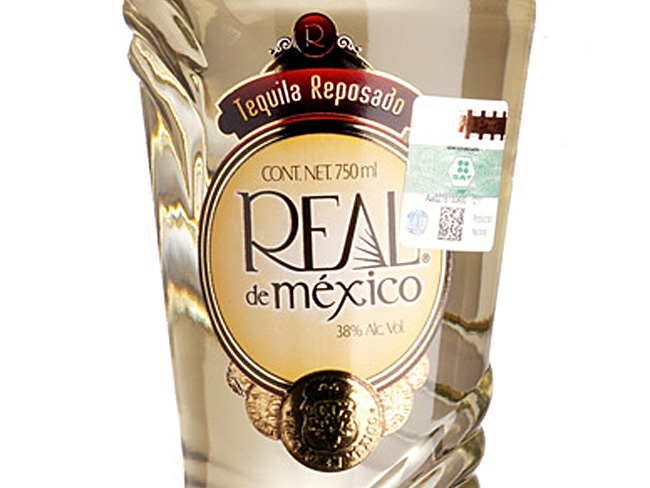
Tequila Real de México

Tequila Real de México

Tequila Real de México
Winner of Worldstar Packaging awards 2008 - Beverages category
Its concept of delicate aestheticism evokes the memory of a woman’s waist wrapped in her shawl. Its delicate and functional figure marks a perceptible difference with any other product. Before the consumer’s eyes are shown the nuances of the succulent contents which result in a product with a clean, soft and elegant image, elements which help to conform a formidable product.

ENVASES is a Vitro business unit that produces glass containers for the food, beverage, cosmetic, beer, pharmaceutical, and wine and liquor segments.

a Lighter or a Spoon?

a Lighter or a Spoon
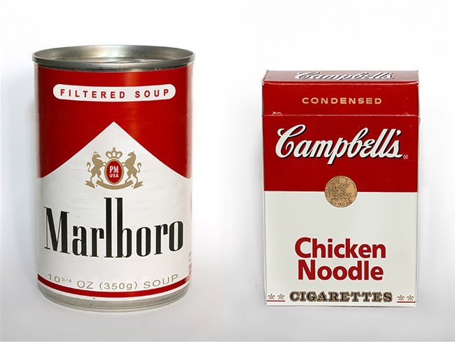
No there is nothing wrong with your eyes, the "Marlboro filtered soup" and "Campbell Chicken Noodle cigarettes" is the result of cleverly done cross-matching of a Marlboro cigarette pack with Campbell soup tin can by GoranDA.
So the question is.. What do you need?
A lighter or a spoon?

Le Whif Chocolate


Picture source : Gizmodo
Le Whif is a new way of eating chocolate - by breathing it! Imagine, chocolate without the calories. Be the first to try inhaled chocolate in one of three flavors: mint chocolate, raspberry chocolate, and plain chocolate.

Harvard professor David Edwards, lead inventor of Le Whif, says: "Over the centuries we've been eating smaller and smaller quantities at shorter and shorter intervals. It seemed to us that eating was tending toward breathing, so, with a mix of culinary art and aerosol science, we've helped move eating habits to their logical conclusion. We call it whiffing."

Le Whif is a terrific way to curb your appetite or to accompany a coffee, and Edwards says inhaled chocolate is just the beginning. New culinary innovations that involve eating by breathing are being developed by the Foodlab at Le Laboratoire, Edwards' art and science innovation center in central Paris.

Two Pianos

Two Pianos
Designed by Studio 360.
Gorisek-Lazar “Two Pianos” is one of the rare piano duos in Europe, playing an extraordinary mixture between contemporary classical and jazz music. The challenge in designing this CD sleeve was to get maximal visual and emotional output using basic graphic elements. We wanted to highlight their vibrating energy using a single thin line “traveling” through the sleeve (and dividing it into two triangles, symbolizing two pianos), expressing an amplitude of common and, in the same time, individual musical voyage.

Friday, September 25, 2009

Segreto Wine


Takk! Design took on the task of developing a brand that reflected the Segreto´s family special vintage for the 2004 harvest. The wine was made for the family special reunion and was a limited edition in some market places.

Jealous Fruits


Feeling resentment against cherries because of their success? Certainly the other fruits do. "Feel me", "Squeeze me", " Juice Me"... There is nothing more fun than fruits each calling out for attention.
Packaging design by Laurie Millotte of Brandever. Illustration by Sarah King. updated - 03 October 2009

Guiness


Designed by Jones Knowles Ritchie (jkr)
On this historic day 250 years ago Arthur Guinness signed the lease on his Dublin brewery. Today this will be celebrated by the brand on a global level with parties, charitable funds and special packaging all part of the mix.

This week also sees the launch of overhauled packaging for Guinness Draught in can by jones knowles ritchie (jkr). jkr were challenged to produce an eye-catching can which evokes positive associations to the iconic brand – simply, to make a good pack great.

The team elected to do this via a full-blooded use of the traditional harp emblem. This approach has resulted in a single-minded design which better acts as a “badge in the hand”.

In research the findings were conclusive - the new design increases quality perceptions via deceptive simplicity and is significantly more noticeable on shelf than its competitors.

Sustainable CD Case


Yet another cleverly done sustainable packaging straight from Professor Sylvain Allard's classroom!
Here's a simple concept as proposed by Elie Monge in my packaging course to replace the traditional CD case. The system is actually proposed in a detachable continuous strip adaptable to the number of CD to be packaged. This package contains no adhesive and is made of recycled and recyclable cardboard.

Paradise


Artel Artyomovyh developed the package design for 3 groups of coffee: classic, exclusive, maragogipe for Gourmet-club™. Freshly launched, the new product - "Paradise сoffee briquettes" aimed at selling through it's own coffee-shop network.
As there was intended to manufacture small lots of coffee briquettes we decided to use common design of package. Coffee types personification has been realized using individual stickers attached to a briquettes surface.


The Paradise gift set "World's best coffees" consist of 8 most popular types of coffee. It was designed to symbolize traveller's suitcase. Simple, low-cost solution of package allows easily either to demonstrate content in coffee-shops or to transport and present collection.

Inset


Cleverly designed 2-in-1 salad servers by Judith Hoefel for the very awesome Fred and Friends!
These sleek and stylish salad servers are two of a kind - they nestle perfectly together for presentation and storage. They’re crafted from high-quality stainless steel with a fine brushed finish. The creation of renowned German designer Judith Hoefel, InSet is designed to love and built to last. Each pair is nestled in a clear-lidded gift box.

Thursday, September 24, 2009

Culture Bio


Designed by CB'a Design Solutions, it is a leading European branding and design network of 10 offices in 8 countries. They combine our local marketing knowledge with a global strategic vision to help their clients build their brands and businesses.
Development of the Bio Composition concept “ The first bouquet of vegetal natural extracts concentrated in a beauty product”Put the ingredient’s names in a bouquet for more pedagogy, truth and tracability.
Explain simply the bio-cosmetic by remaining in the democratic and accessible spirit which is Yves Rocher reason to believe.
Being different and justifying the bio process but still recruiting and not going on the natural territory of many other ranges.

Vital Touch

Vital Touch 1

Vital Touch 2
Vital Touch 3
Vital Touch is a Devon-based business that's building a strong reputation in the specialist health care sector with natural and organic products for body and soul. ico design rebranded both the the company itself and its Natalia range of products.
Vital Touch’s products are all about purity of natural ingredients and simplicity of use. These qualities informed the main graphic treatment of the rebranding of the extensive Vital Touch Natalia range of aromatherapy and massage products for pregnancy and birth. A palette of natural colours and the use of screen printing and recycled papers creates a distinctive, range of desirable items - from organic bath soaks to massage booklets. Our choice of materials for the bottles, boxes and literature was key, echoing one of Vital Touch’s key messages, ‘feel life’ - they invite the customer to touch.

El Ramón


Designed by Javier López Pereyra.
El Ramón is a toy-object created by the Argentinean Art Director , Javier López Pereyra. El Ramón was, inspired at the 50´s and 60´s concept of spaceships and robots, such as the movie “War of the Worlds ” dated of 1953, the tv series “Lost at Space” dated of 1965 and the cartoon “The Jetsons” dated of 1962, among others. Ramón is a limited edition, hand crafted with Argentinean wood, flexible iron and recycled gray paper with silk-screen print.