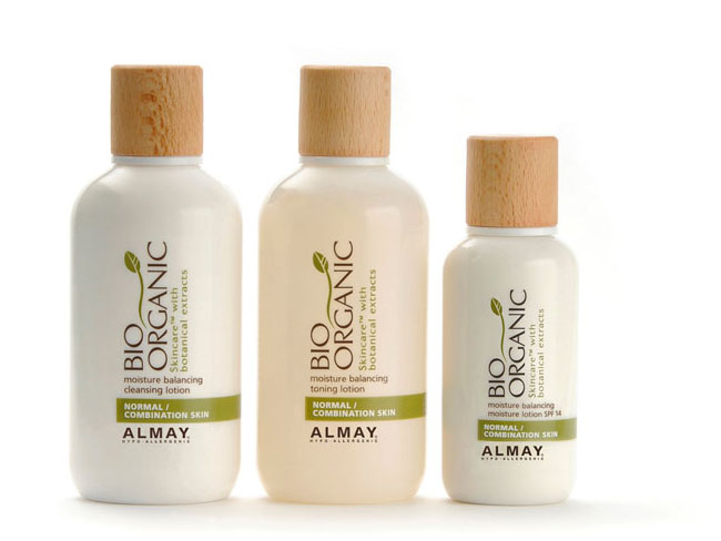
Bio Organic skincare range which is 90% eco-friendly and 100% recyclable. Packaging design for Almay’s designed by Moag Bailie, South Africa.


Himalayan Institute is a leader in natural self-healing and total health. For their holistic line of Neti Wash products, herbs and botanicals we have created a brand that promotes simple solutions with an authentic remedy.


Nowadays, everything that focuses on home-made & off mass-produce is easily hearted by consumers, especially in food packaging. This strikingly simple bottle design of Confiture et Provence's Citron ginger syrup is really nice to have in your kitchen, not to mention the healthy of ginger. And the most important is we can re-use the bottle for our very own home-made syrup or as an olive oil container.
Besides the Citron ginger syrup, another nice packaging from Confiture et Provence is their SASHE (sachet) set syrup. Packed in small plastic packet of 30g each, SASHE is design for you to have a taste of over 200 different kinds of basic or a combination of two or more ingredients Confiture have. Like a palette of colors, SASHE is just lovely to have as a gifts.
Confiture et Provence produces are seasonal. They make all kinds of syrup, jam & cookies from a combination of two or more fruits, herbs, spices and alcohol. Because the ingredients use is from the period of a season, the recipe is slightly adjust to the taste of the ingredients. So every Confiture's produce is the taste of the year.


From my Spring 2009 Package Design 1 course at Art Center College of Design. The brief was simple: redesign a compact florescent lightbulb package. Here's the description of my concept, taken from my final presentation:
The compact florescent light bulb (CFL) is a recent innovation that combines radically reduced electricity usage with a significantly longer bulb life span. While the bulbs themselves are appealing to the environmentally conscious, the packaging for the bulbs has been less than environmentally friendly. Until now.
Made from 100% recycled White-Line newsback and printed with soy inks, this packaging compliments the eco-friendly contents. The box includes information on proper disposal for CFLs and a postage-paid mail return sticker, enabling the consumer re-use the original packaging when returning the bulb to GE for proper disposal.
Finally, extensive research has shown that if a customer can be persuaded to take a GE product off the shelf, there is a 70% chance they will purchase it. This innovative and refreshing package design will ensure that the GE CFLs will stand out, making this a good choice for the environment, as well as GE’s bottom line.


The Teaosophy team had a unique new tea delivery system, but needed to create a brand identity, naming, packaging and brand communications platform that would effectively tell its story and connect with the customer in a crowded marketplace.
Challenge Outlined by Lemley Design’s Research: Lemley Design understood that its primary challenge would be to establish a brand identity and brand communications that would become prominent among the large number of tea brands in the marketplace. The firm needed to convey that the unique Tea Pod® delivery system was much more than a marketing gimmick. It allows for the proper infusion of tea to the customer’s individual taste. The use of leaf tea rather than fannings and dust, and the unique pyramid shape of the Tea Pod®, release the complexities of the tea gradually, increasing the flavor and heightening the experience of the drinker. This is tea “to refresh the mind and body”; it is not merely a drink. It is a deeply satisfying, culturally connecting experience.
Lemley Design created a brand platform for Teaosophy that is as unique as the company. The logotype for Teaosophy features the positioning language “the study of tea” and a human form outlined against a long, slender tea leaf. The intricate human aspects of tea, the culture and ritual around tea drinking and the human interaction with nature in the growing and selecting of tea by hand are brought together very clearly in Lemley Design’s brand platform for Teaosophy. The fusion of deep and ancient cultural roots and the most modern of technology come together seamlessly. The firm also brought out the Brand as the authority on tea, experts and specialists with connections from the tea growers in Asia to customers world-wide.Lemley Design extended its brand strategy and identity for Teaosophy into a number of key brand communications: product naming, packaging system, POS strategy, and positioning language. The firm also developed brand identity usage guidelines for Teaosophy.
Teaosophy’s online store and brand communications are cohesive and relate a remarkable story. . .one that connects at a basic, human and cultural level. The brand is now positioned to become a leader in tea technology. It is also positioning itself to not only retail its products directly to the customer, but to sell its specialty teas to gourmet and specialty retailers and food service. Teaosophy was awarded the Gourmet Retailer Product Packaging of the Year award.

Grace’s Kitchen sought out Lemley Design, to revitalize the brand of a fledgling product line: create new positioning in the marketplace, demonstrate the gourmet quality of its offerings and repackage the line to allow the company’s offerings to shine. Challenge Outlined by Lemley Design’s Research: It was obvious to Lemley Design that Grace’s Kitchen had a great concept but the company had not capitalized on it. Repositioning the brand as an innovative line of gourmet quality meals that were both epicurean, yet approachable in the grocer’s frozen food case was the first order of business.
Lemley Design recommended Grace’s Kitchen pare down its product offerings to focus on a group of core meals that would be branded and positioned as “week-night gourmet entrees befitting weekend dates for two”. The top quality, chef-made meals were then repackaged with beautifully styled lifestyle photography to show the gourmet quality of the entrees. The new packaging photography would be at home in Bon Appetit or Gourmet magazine. Lemley Design’s efficiencies also cut packaging costs by 70%.
When Grace’s Kitchen debuted its revitalized brand and packaging at The Fancy Food Show, the company received more orders in that week than they had ever had in their history. In a twelve month period, distribution increased from 30 stores to over 1000 and prior to their sale and restructuring in 2008, the specialty food manufacturer was producing over 60,000 meals per month for grocers nationwide.


Crayola has a lot of brand equity in their color names. I wanted to create a series of packaging (here: forest green, mod magenta, and purple mountain magesty) which playfully accents these color names.


The idea behind the design is to do sustainable, organic, label free packaging. Since all produce grown at organic farms is just a little bit different from each other, I decided to make everything about the packaging, just a little bit different from each other. The phrase "the grass is greener of our side" is the concept behind the designs. The paper used for the bag and menus at their store and cafe is 100% recycled and biodegradable, made with grass seeds. So however it is disposed of, wherever it ends up, grass will grow, a way to give back to the farm's free-range animals.
All type used in the packaging is hand rendered in the shape of grass. The milk jugs, which are label-free, have all information printed right on the glass, and would be returned by the customer to be refilled and reused. The cheeses are packaged with biodegradable cheesecloth and biodegradable wax paper. Whether it is cheese made from goat's milk or cow's milk, is differentiated by the sticker which holds the wax paper together. All products/packages are stamped with the farm logo "Nezinscot Farm", again, making each package unique from one another. Even though it is the same stamp, the reproduction on each is just a little bit different, just as produce from an organic farm.


