Tuesday, May 18, 2010

Cascade

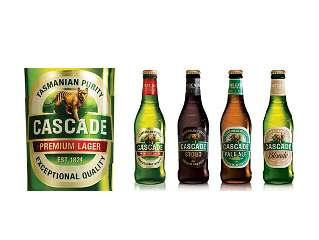
Cascade is Foster’s third-largest beer brand and is brewed in Australia’s oldest brewery at the base of Mount Wellington in Tasmania. The Cascade beer portfolio—made up of two premium beers (lager and light) and three craft beers (blonde, pale ale, and stout)—was fragmented and lacked visual consistency. Cascade’s portfolio volume was also dominated by Cascade Premium Light, which was competing in a declining market. On the whole, Cascade had lost relevance in the competitive premium beer category and needed to redefine itself as a more contemporary, unified brand.
Cascade group

Landor’s task was to create a new brand positioning and architecture for Cascade, allowing for the development of a clear master brand strategy that would be implemented across the portfolio. The challenge was to give Cascade a contemporary look and feel and to ensure that the brand continued to embody its uniqueness through all touchpoints. From Landor this required a deep understanding of—and passion for—the Cascade brand and premium beer category combined with a highly creative design strategy and execution.

Cascade label
From the heart of the brand essence—untamed soul—Landor and the Cascade team reclaimed the Tasmanian tiger as the leading icon for the brand. The tiger provided clarity for Cascade and a direction for all aspects of design—bottle and can graphics and structure, secondary packaging, guidelines, and point-of-sale and merchandising collateral. Portfolio alignment was achieved through a master brand approach that created a unified visual identity eliminating the brand’s fragmentation. Landor also used on-premise merchandise to lay the foundation for future brand building. In 2008, the design was recognized with an Australian Packaging Award.

Designed by Landor, Australia.

Monday, May 17, 2010

A Teaspoon of Sugar

mouse graphic sugar packaging
Latest work by Mouse Graphics, Greece.
This work is a conscious attempt to literally interpret the pack content: 'One spoonful of sugar' - visually and verbally stated. Straightforward and simple, the pack design obviously invites to a more decorative daily cupper.

MYGO Super Fruits

MYGO is a new generation of drink, a super fruit juice, rich in antioxidants. It contains GOJI berry, an ancient Chinese medicinal fruit, often called “ the fruit of happiness”. It is believed to stimulate and boost your fundamental energy. Mygo is also rich in Vitamin C, and is a healthy and effective alternative to current energy drinks.
MYGO Super Fruits Group Shot

MYGO Super Fruits Blue
Delicious fruit cocktail made of a combination of Blueberry and Gojiberry, a fruit with one of the highest concentrations of vitamin C, full of nutrients and antioxidants. MYGO BLUE combines these two fruits for an intense experience. Super tasty, super vitaminized, super healthy. Known to contain high levels of anthocyanins.

Designed by B&T.

Septiembre


Bodegas Trapiche commissioned Tridimage to renew the brand image and packaging of their cool wine September, one of the leaders of the Argentine market. Based on the concept of "Spring night" the flower icon builds colorful patterns in each label.

Designed by Tridimage.

Sunday, May 16, 2010

Ipacs Winery

Ipacs Winery is a young, emerging, dynamic developing and already successful winery led by an ambitious owner.
ipacs winery wine bottles

Our task was to design the CI and the packaging for the winery. Neither the package-technology nor the budget of Ipacs can rival with the historic wineries. Thus the designer's goal was to make advantage of the disadvantage. The quite unusual flag-like label was born thanks to this pressure. The label holds all important information so the tag on the bottle could concentrate exclusively on the branding.

Designed by Café Design, Hungary.

Wednesday, May 12, 2010

BeneVia

BeneVia Health Drink bottle

BeneVia Health Drink box
BeneVia health drink packaging by Periscope, United States.

The Bay Tree

Bay Tree Range

Bay Tree Bottles
Irving have been commissioned by the founders of The Bay Tree to overhaul their complete range of food products. In short their philosophy is that The Bay Tree food products offer a ‘helping hand in the kitchen’. Products such as ready made cooking sauces, pickles and condiments help busy people save time in the kitchen. All of the products are hand made in The Bay Tree kitchens rather than processed in a large factory. The best possible ingredients are used and were possible they are sourced locally – these ingredients are often reflected on the labels. The hands-on, informal and friendly approach of the founders Emma McDonald and Lucie Lewis is reflected in the design of the labels. Irving have been working with the celebrated British illustrator Chris Brown to bring charm, wit and a distinctive personality to the brand.

Designed by Irving & Co, United Kingdom.

Preece


Australia’s leading illustrators were commissioned to create artworks inspired by the Mitchelton winery in central Victoria for the latest Preece re-branding. The rejuvenation has elevated Preece into the top 50 best selling wine brands in Australia.

Packaging by Frank Aloi, Australia. It is the finalist at the AGDA Awards.

Scrap Drives


From November 2008 until April 2009 I did extensive research on electronic waste and recycling. Based on the results of my research I developed a series of recycled USB flash drives that would inform their user of ways to recycle their electronics. Each drive included a hand-made package and digital resources. I also developed a point of purchase display, a website, a time lapse video, and a book showing my design process.

Designed by Matt Ritchie. Matt also did a website [http://attichermit.com] that teaches users about the flash drives themselves, giving a brief description of the problem, and what they could do to help.

Belle & Ella Pharmacy


Boutique pharmacy catering exclusively to women, Belle & Ella offers discreet service and modern advice from the female perspective. This prescription packaging system is a modern and elegant solution to the unattractive, cluttered packaging offered at generic drug stores. The goal was to encourage repeat use of containers and to keep personal information private when needed. These reusable aluminum containers use a peel-back vinyl label that allows medical information to be concealed, and looks unassuming when sitting on a shelf. Women can feel confident carrying meds in their purse, or leaving them out knowing that their intimate personal details are out of view.

Designed by Veronica Stark, Canada.

Monday, May 10, 2010

Vinhos Lagosta


Pitch proposal for the re branding & new packaging of Rosé & Vinho verde of Lagosta Wines. Lagosta (Lobster) is a fresh summery wine that goes well with all kinds of fish and sea food.


The proposal of the bottle aimed to recreate and modernize the traditional "Mateus Rosé" bottle while aiming for a more sophisticated audience.

Concept by Rui Granjo, Portugal.

Superdrug Tea Tree

superdrug tea tree range
Superdrug Tea Tree range designed by Burst Ltd, United Kingdom.

Schmoo

biz-R have recently completed a naming, brand identity and packaging project for ‘Schmoo’, a new yoghurt lassi drink.
Schmoo, a Leeds based company, plan to bring the authentic Indian lassi to the UK mainstream. The brand positions itself uniquely between smoothie and dairy (which has also formed the basis for the new name) and uses 100% pure ingredients with no preservatives - created using genuine Indian recipes.


“The identity draws influence from traditional Indian henna (mehndi) illustration but is executed in a contemporary aesthetic with a touch of modern opulence. East meets West if you will. The brand offers a clear point of differentiation from other drinks commonly sharing shelf space. An exciting, healthy product with a sense of confident sophistication - this formed the basis for our brand direction for Schmoo. The final result is both unique and eye-catching. It communicates beautifully and stands apart from anything else on the market.”

- Blair Thomson Creative Director / biz-R


The striking label design has been printed onto a silver foil stock and combined with fresh bright colours to differentiate the flavours in the range. The brand seeks to ‘shake up’ the bottled drinks sector by introducing the lassi to the mass market - which would usually be limited to specialist Asian stores and Indian restaurants.


Hayley Hadfield, Managing Director of Schmoo comments:
“From the initial brand workshops biz-R ‘got it’. They understood the essence of the brand and were not shy in coming forward with ideas. This was the confidence we were looking for and that was difficult to find with other agencies. We are really excited at the prospect of developing Schmoo together and continuing to take it forward.” Schmoo has been launched initially in Tesco stores throughout North England with plans for further expansion in the near future.

Designed by biz-R, United Kingdom.

Boost Your Wash

The Core has created the new pack design and structure for an innovative new product set to revolutionise the UK laundry industry. Developed by Challs International, Boost Your Wash is a brand new wash enhancer with a unique formula designed to transform any washing detergent into a powerful cleaner. And unlike washing powder, it has antibacterial properties, so it not only tackles stubborn stains but also kills bacteria, leaving laundry clean, fresh and odour and germ free.
 Boost Your Wash closeup

Like its unique formula, Boost’s packaging offers a shake-up for the category. ”It’s a different kind of a design for a different kind of a product”, says Andy Briscoe, Creative Partner, The Core. “We wanted it to feel more like a little helper than a stain remover, so we deliberately distanced ourselves from the ‘scientific’ swooshes, molecules and atomic-era colours which dominate that category. The laundry cues are all there – the clothes, the open-air freshness, the burst of sunlight, but they come together in a new, contemporary illustrative style that sets Boost apart from its competitors.”

 Boost Your Wash
In a fixture dominated by tall bottles and big boxes, Boost’s structure is also set to make an impact on shelf. Bespoke designed by The Core, the bottle has a broad base and a stocky, curvaceous build that has something of the ‘little hero’ about it, with echoes of other small-but-powerful products like probiotics and energy shots.

Says Kieran MacSweeney, Sales Director of Challs International: “We’re really excited about the launch of Boost Your Wash as it brings something brand new to the UK laundry industry. Our research shows consumers are waiting for a product like Boost Your Wash so we’re confident it’s going to be a real success. The timing is good too as the tough economic conditions mean consumers are being financially conscious but still want the best results possible for their daily washing. Boost Your Wash will enable them to beat all of their laundry challenges including stubborn stains, odours and germs.”

Boost Your Wash will be available to retailers from the beginning of May, RRP £3.99, and launches to consumers later this year supported by a national TV campaign.

Designed by The Core, United Kingdom.

Sunday, May 9, 2010

Stiegl (Student Work)

Introducing a beer into an already saturated market a difficult task, but when the beer brand has such a rich history it’s a little easier to distinguish it from the competition.
Stiegl beer close up

Retaining the brands extensive elements; bold blackletter logo treatment, the staircase icon, and deep crimson red kept the familiarity within the brand. But updating and incorporating new elements; such as the diagonal rising label that mirrors the upward motion of the staircase logo, brings a contemporary feel to the traditional brew.
Stiegl beer group shot
Designed by Richard Perez of Skinny Ships. This is one of his academic projects.

Thursday, May 6, 2010

Green Seeds


This won Mr Jiang the Gold Prize in the Zhenhai Cup Design Competition.
The popularity of bottled chewing gums is accompanied by people 'having to' pollute the environment. Therefore, I designed a kind of gum bottle that can help people package chewed gum and throw away later -- an invention that help people achieve their environmental-friendly selves. I named it 'Green Seeds', because I believe that for the nature, less pollution equals more affection.

Designed by Gonglue Jiang.

WAT-AHH!

See what Kelly, a 22-year-old college student, has to say about this funny new beverage called WAT-AHH!
WAT-AAH! is a great product because it’s basically it is targeted to kids to make them choose water instead of sugary, fattening drinks. The entire mission of WAT-AAH! is to prevent obesity in children. Living in the US, I think that’s a great idea because it is one of the fattest countries in the world (not the fattest, but #9 on the fattest countries list according to a study done by the World Health Organization, yup I researched this, Nauru is #1).


I thought the whole style of the bottle was really fun and eye-catching for kids. It’s not just a boring Aquafina bottle or Poland Spring, it’s got a different shape and the colors used to write WAT-AAH! is eye catching, I feel like kids would think this whole style is very hip and cool looking.

Wednesday, May 5, 2010

Delphic Acolyte


Delphic's Limited edition "Acolyte" CD packaging with slipcase, exclusive to HMV stores.
Designed by Non Format, United States and Norway.

Gyulai Palinka Spirit

The original 'pálinka' is a distilled spirit made of fermented fruits.
Only those products can be referred to the 'pálinka' which are made from
Hungarian fruits, have 100% fruit content and got 37,5% of alcohol strength
as a minimum.
gyulai_palinka bottle

The first distillery in Gyula was founded by János György Harruckern in
1731. This nearly 300 year-tradition is carrying on by Gyulai Pálinka
Manufacture (in these days).

gyulai_palinka bottle range
The task was to create a new packaging design which focuses to the mature
young generation. The key motive of the new design is the Hungarian hound,
which is fidelity, nobility and got all the traditional values.

Designed by Peter Berki of Café Design, Hungary.

Tuesday, May 4, 2010

18 Rabbits

18 rabbits snacks

When Divinely D'lish, a beloved San Francsico granola brand, decided to expand their demographic, we started at square one, devising a more authentic brand story, crafting a unique company name, as well as creating a new brand aesthetic across all products.

18 rabbits snacks orange
Based on the founder’s own experiences as a child raising eighteen pet rabbits, the goal was to make the visual identity more distinct, easily recognizable, as well as fun. The bright color palette works as a labeling system, allowing the customer to easily identify their favorite flavor on the cluttered supermarket shelves, as well as signifying what products are wheat free, dairy free...etc.


Designed by Eric Janssen Strohl, United States.

Nature's Splash

Kraft Nature Splash Drinks
Instant beverage packaging designed by NiCE Ltd.

Monday, May 3, 2010

Universal Packaging System

Universal Packaging System 1

Universal Packaging System 2
Universal Packaging System 3
It seems a box is always too big or small so designer Patrick Sung came up with flat sheets of recyclable corrugated cardboard called the Universal Packaging System or UPACKS. The patterns make it easy to fold and conform to almost any shape while maintaining structural rigidity and protecting the contents. Love the idea of saving on packaging but will this actually work? I suspect each sheet would have to be sufficiently padded; not too thick, not too thin, but just right said Goldilocks.

Designed by Patrick Sung.
via: Yanko Design.

Babushka Anya

At the time “Babushka Anya”, one of the leading brands of the “Santa Bremor” company who operates in frozen foods industry, came to KIAN brand agency, the client viewed the brand as unmodern, without a clear identity, and being perceived by the consumer as uninteresting, correspondent to the lowest price segment.
anya frozen foods

The primary renewed visual brand conceptions for “Babushka Anya” were bright and radiant colors as well as graphic works, such as unusual shaped clear areas, positive graphics in the background, as well as creative font solutions. The redesigned trademark made the image of the personage more bright and attractive. The background drawing with the clear area is an identifier of the corporate style, and at the same time carries out the practical function of masking the small defects of the product.

Designed by KIAN Brand Agency, Russia.