Tuesday, December 30, 2008

You Smell


Thanks to Megan Cummins, a recent graduate from the Savannah College of Art & Design, for sending his amazing work to us. Check out his Britannia packaging too!
"This is a line of detergents called “You Smell” is an immediate eye-catcher, as it is eloquently presented, yet is initially insulting until the reverse side of the product is read. It continues to say “Like a Lemon!...Thanks to us!”. The subsequent title “Tabula Rossa”, a derivative of "Tabula Rasa", a Latin phrase for “clean slate”. The sarcastic romance copy on the remaining sides creates an entire experience for the viewer, enticing them to continue turning the product in search of something new. It is printed on Neenah Laid paper to offer a subtle tactile quality."

Heal's Tolietries


Designed by Brandhouse, their mission is to make Heal's range of toiletries tell a story about "Desirable Minimalism".

Monday, December 29, 2008

Paulette Macarons


Perfect combination of Paulette’s unique macarons with their signature gift boxes, a perfect gift for any occasion. I'm curious which design agency is behind these packaging?

Today's Tea


Interbrand had designed this very refreshing tea packaging. Thank you Charles Cranes for the images.
"So when Lottechilsung approached us with their new tea, Oh Neul Eui Cha (Today’s Tea), we knew the package would really need to stand out.
Based on the concept that the tea gives the benefit of feeling mentally refreshed and physically fit, we created a soft, calligraphic effect, using the look of a flower – nature’s motif. But to really stand out in the market, we used a unique material that is highly portable and keeps the tea at its ideal temperature. Not only is it attractive to our target consumer, but it also stands out on the shelves that are full of plastic bottles.
Today, no doubt to its spectacular package, Oh Neul Eui Cha is Korea’s leading health tea brand. It was selected as “The Consumer Product of the Year” by The Korea Economic Daily and “Best Hit Product of the Year” by Seoul Economic Daily."
Packaging design by : Interbrand

O+ Oxygen


New packaging from Spunk Design Machine:
"Oxygen plus features concentrated oxygen as a natural supplement to help elevate energy, increase alertness, and restore your get up and go. This version of O+ packaging was designed to reach toward the active lifestyle market. Simply breathe in and get energized."
via : thedieline.com

Kamenitza LEV


Bulgarian beer maker Kamenitza AD, member of the InBev group, has introduced its latest product - Kamenitza Lev, which will be added to the company's portfolio that includes Kamenitza, Beck's Stella Artois, and Astika among other brands.
via : Packaging Europe
Packaging design by : Flex Cocoon

Friday, December 26, 2008

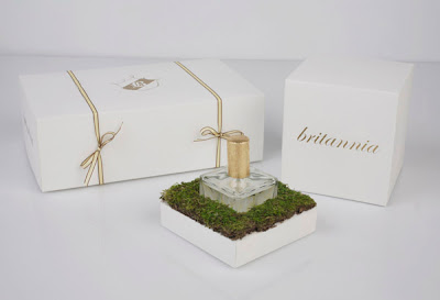
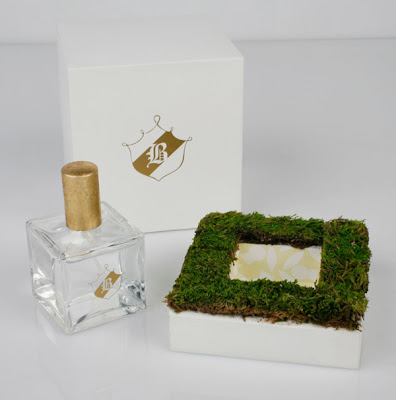
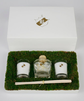
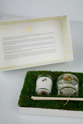
Britannia

britannia1
britannia2
britannia3
britannia4
britannia
britannia5
Thanks to Megan Cummins, a recent graduate from the Savannah College of Art & Design, for sending his amazing work to us.
"This line of fragrance was an emotional branding study. I chose one person as the demographic and created a product which would be irresistible to her. She is highly intelligent, with a love for Britain and the countryside. She enjoys classic literature, Old English crests, and minimalist design. The boxes focus on tactile qualities over graphics, having the soft touch of touché complimented with the rough moss. The overall experience is clean and fresh, with the products appearing to be little treasures one would find on a walk through the countryside."
Packaging design by : Megan Cummins

Full Tank


Thanks to Turnstyle for sending this in.
Full Tank Baby Fuel is the first frozen baby food to combine the benefits of home prepared veggies with the convenience of portability. Baby Fuel packages the freshest organic ingredients in a travel-ready squeeze pouch that fits in your pocket or purse and can even be eaten without a spoon.
Packaging design by : Turnstyle Studio

Thursday, December 25, 2008

The Holiday Mood Is In!


Sorry for not posting this greeting earlier as I had just recovered from the seasonal hangover!
Well, HAPPY HOLIDAYS and go all out and enjoy all you can!
- subby

Dumbbell Packaging


Tommaso Ceschi designed this lovely innovative packaging which can act as a water bottle, a cleaning detergent container and a dumbbell!
"The whole communication of "Mr. Clean" trademark is principally based on strenght and physical power concepts , well represented by the famous bald muscle man logo. With this dumb-bell packaging we have tried to find a simple but incisive shape to strenghten that idea and to give product more visibility on supermarket shelf. We have also considered packaging reusability as an important feature: the empty bottle can be easily filled with water or sand and transformed in a colourful dumb-bell for fitness. A fun excercises booklet inside the cap can be useful for home training."
Packaging design by : Tommaso Ceschi

Monday, December 22, 2008

Azita’s Almost-All-American Hot Sauce


Thanks to our reader, Fred Atkinson for sending in the images.
HOT = FIRE = AZITA's HOT SAUCE
Thats how designer Michael Freimuth came out with this packaging design.

"The packaging designs for Azita form a system of abstracted flames from their silhouettes; the designs for each is language literally pulled from conversations with Azita and are indicative of the talkative, expressive nature of the chef and her recipe."
Packaging design by : Michael Freimuth

Sunday, December 21, 2008

Tag


Awesome body spray packaging design from united, which we featured their "Me by Mezhgan" and "Pepsi Mojito" recently.
"Teens are looking to align temselves with brands and individuals who speak their language. They are smart and see through the "follower" and "wannabe" brands."

Packaging design by :
united


Hilo Hattie Premium


Care for a good cup of coffee with macadamia nuts? Well you could enjoy them with this beautiful proposed packaging design for Hilo Hattie Premium, by Jesse Arneson while at Wall to Wall.

Saturday, December 20, 2008

Love SavesThe Day


Awesome naughty retro illustrations on the labels by 999 Design. And now they been tasked with developing packs for coffee, wine, champagne, pasta, olive oil .

"Established almost 10 years ago, Love Saves the Day has become an integral part of Manchester's cultural and social district providing the city's discerning food lovers with a unique venue in which to meet and eat.
We pulled together some great retro glamour illustrations. Big hearted gals on good old fashioned jars reflecting the character of Love Saves the Day, and raising a smile with the customers. It worked a treat."

Packaging design by : 999 Design