Wednesday, September 23, 2009

Kee Wah Bakery

Sets of Chinese bakery packages designed by Design Boutique Limited, Hong Kong. Edited - 27th Sept 2009
Kee Wah Bakery is a family owned business founded in 1938. Kee Wah is a well-established Chinese bakery producing high quality traditional pastries in Hong Kong with branches in Taiwan and the U.S. Their corporate and product identities had undergone several changes over the last 50 years and our client decided to establish a new uniformed corporate image once and for all.


Traditional Chinese Pastries
Package design for traditional Chinese bakeries, Pineapple Shortcakes in different flavors, and Egg rolls. All come with the choice of large or small packages in paper box or tin container.


Wedding Pastries
Along with the re-branding process, Kee Wah decided to invest more money on their product packages. The newly packaged “Kee Wah Bridal Pastries” displayed at the renovated wedding counters at all Kee Wah retail stores helped generating impressive sales records. “Kee Wah Bridal Pastries” became a fashionable gift for young couples in Hong Kong.


Moon Cake
Moon-cakes are purchased to share and give away to families and friends during the Mid-Autumn Festival. The retail of Moon-cakes is highly competitive; the new brand identities improved the company's equity, enhancing and differentiating their products on the market.
Choices of sizes and flavours of "Kee Wah Premium Moon-cake" were designed in reusable tin can and paper box packages to match customers’ budget. The sale rose dramatically and soon Kee Wah established its brand equity in the Asian communities around the world.

Tuesday, September 22, 2009

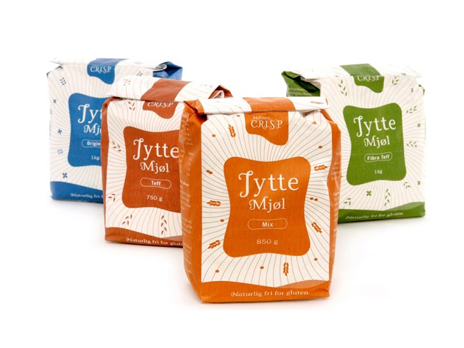
Jytte Flour

Jytte flour

Jytte flour
Designed by M8 design, they won Silver in the 2009 EDAwards under "food and beverages packaging". Beautiful typography and color usage that gives a fine and clear series of character.

Mix1


Designed by tda advertising and design.
mix1 is a "all-natural liquid nutrition" that needed to stand out among the thousands of smoothies, juices, superfoods and wheat grasses already out there. We discovered that nobody was using big type with one solid, appetizing color. Probably because the look reminded people of tempra paint bottles. We went for it, and so far, it's a big success.

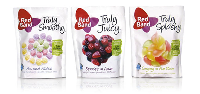
Truly

Truly Juicy

Truly Juicy
Designed by Mountain Design.
We are delighted to share with you this codebreaking concept that we have developed for Leaf International: Truly. We have created the positioning, naming and identity for 4 different lines of sweets.
The result is an outstanding identity with fresh looking white paper-look bags and mouthwatering visuals. All Truly Juicy, Truly Black, Truly Smoothy and Truly Splashy products contain great sweets with natural colorings and less sugar, that you can enjoy without worries. To support this lighthearted proposition, the designs are accompanied by some truly involving copy. Better hurry to the stores!

Stonyfield Farm Yogurt


Webb Scarlett de Vlam redesigned the identity, Yo baby, Yo Soy, and many other Stonyfield products.
"Stonyfield Farm’s new package design clearly stands out on shelf, but more importantly, Webb Scarlett de Vlam worked hard to understand our core values and authenticity to ensure that the new design reflects the Stonyfield ideals. We featured a photograph of the Wayside Farm, one of the many Organic Valley family farms that supply our milk for our yogurt. We are proud of the fact that our organic milk comes from real family farmers who run real, organic farms and make real food for real people. Our packaging, which is our most important consumer communication medium, now reflects who we are and what we have stood for for over 25 years. Not many companies out there can wholeheartedly say that and mean it." -Attessa Bradley, Brand Manager

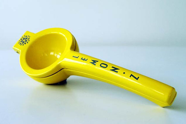
Lemon Z

LemonZ

LemonZ

Designed by Tardis Design and Advertising, based in Wellington, New Zealand. Check out their Archangel Wine packaging too.
Iconic packaging was required if this fresh Antipodean take on limoncello was going to fly. Initially aimed at discerning seekers of new taste experiences, a striking presence was a key goal in attracting their attention. The creative brief demanded the packaging be 'proudly NZ at its contemporary best' which was delivered in full in the final design.

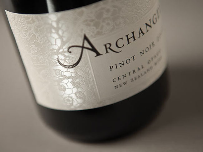
Archangel

Archangel

Archangel
Archangel
Archangel
Designed by Tardis Design and Advertising, based in Wellington, New Zealand.
The unique brand story of Archangel is one steeped in love, hope and fate. Starting in war-torn Poland and continuing to this day- a generation on in New Zealand - it's about the interlacing of relationships and destiny. An antique European lace reflects this interwoven tale which embossed, over-glossed and pearlised print finishes hightlight the densely textured quality of this incredible journey.