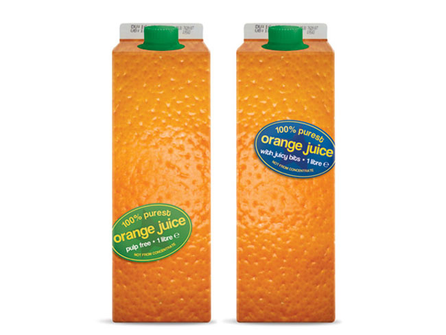
Concept for Fairtrade orange juice in cartons. The orange peel imagery covering the whole pack conveys that 'just squeezed' freshness and the uncluttered, elementary design supports the product's claims of unadulterated purity.
Designed by Phil Harvey. I love the usage of the oval sticker label on the orange skin, awesome! Some may compare it with packaging work of Naoto Fukasawa.
No comments:
Post a Comment