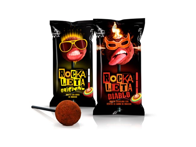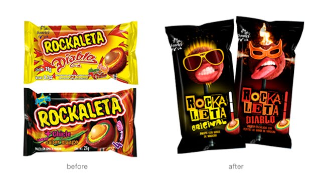

Our lollipop stars are like nothing on the shelf – making Rockaleta highly memorable and cool to teens who are looking for edgier ways to express their individuality.
We chose to rebuild the brand image on a black package, as a cool-anti-color in the category. The multi-fonted logo reflects the many layers of Rockaleta.
Repositioning the Rockaleta brand to teens meant creating a brand they could connect with that expressed the intense chili & fruit experience that these Mexican lollipops create in your mouth. By focusing on higher order attributes we helped the brand break away from earlier product cliché visuals.
Designed by Perspective Branding, Oakland, USA.
No comments:
Post a Comment